Transactional Email Templates | Primary
Designed and built Shopify email templates.
02/2021 - 03/2021
1 Product Designer (me)
Email Marketing Director
(Jennifer S. Lin)
Email Design
Template Building
Email Testing
Figma
Liquid & CSS
Litmus
Primary is a kids' clothing brand that makes essential, sustainable, and gender-neutral clothes in a rainbow of colors for babies and kids. In 2021, Primary was wrapping up its migration to Shopify, and the transactional emails (e.g., order confirmation email, shipping confirmation email, account activation email, etc.) were a missing piece of the map.
As a Product Designer, I was assigned to refresh our transactional email designs and build the email templates for our Shopify store. Both email design and the template language (Liquid) were new to me, so I was thrilled to take on the challenge and walk into the unexplored land.
Goals and Priorities
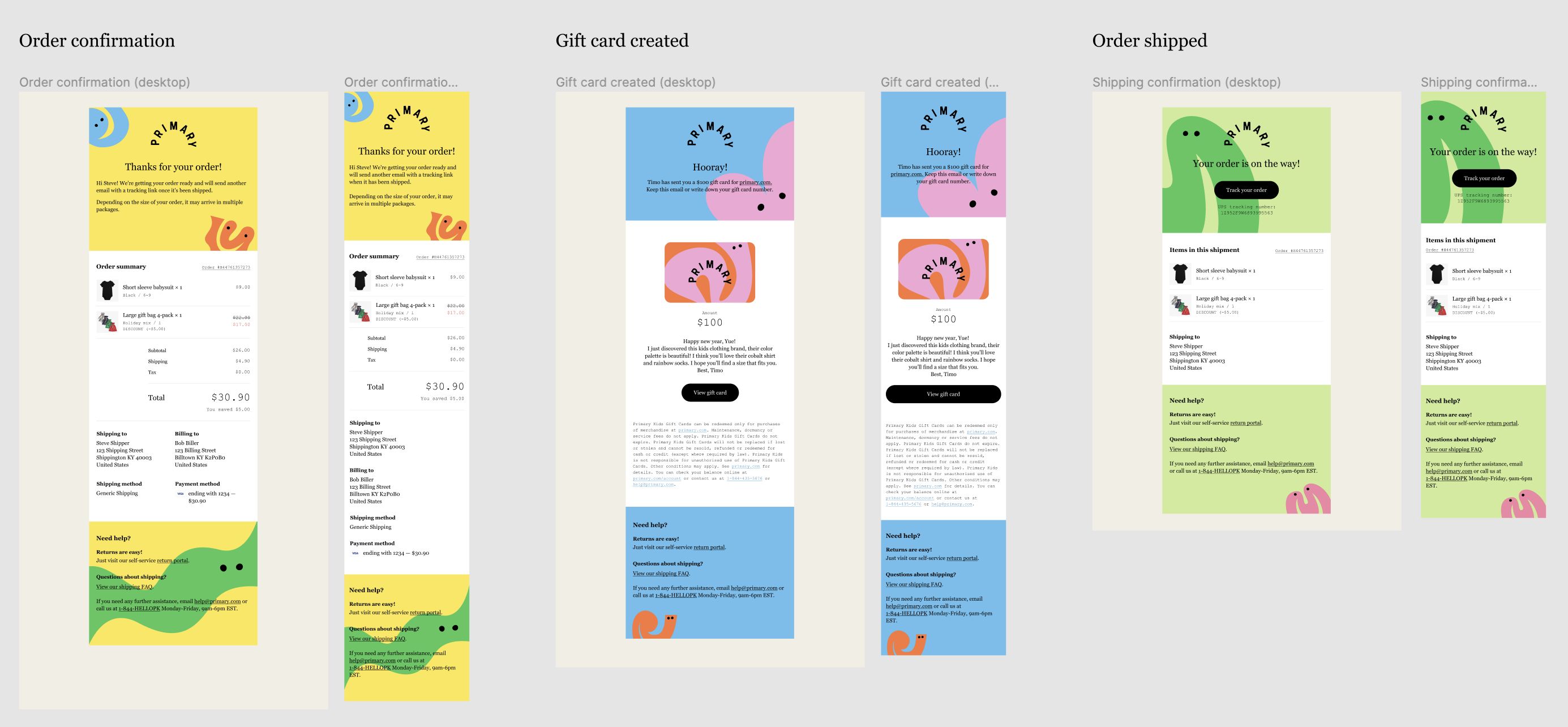
I connected with our email marketing director who listed 9 emails that were projected to have high volumes compared to the rest. These emails include Order confirmation, Gift card created, Shipping confirmation, Order delivered, etc. We wanted these first-tier email templates to look well-crafted, on-brand, and evoke desired emotions when customers open them up.
For the rest 20+ templates, we planned to just update colors, fonts, and UI elements to make the templates look on-brand.
The Outcome
The new transactional email designs were rolled out with our Shopify store launch in 2021. They have been serving communications from Primary to its customers and bringing branded experience to more than 1 million customers.
Design
Building the foundation
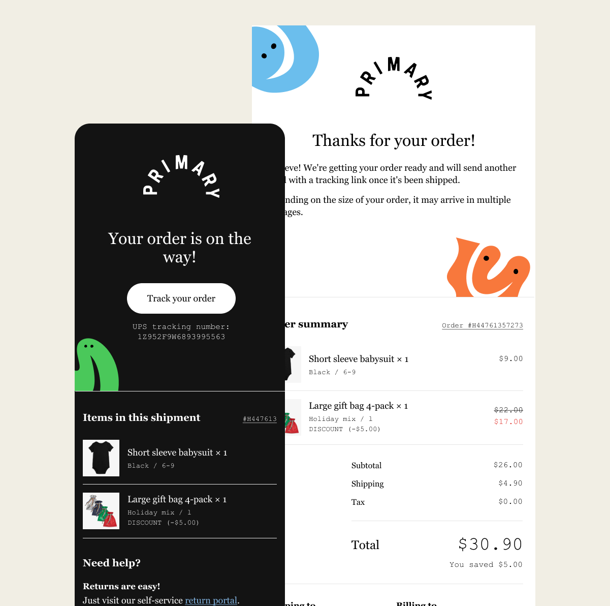
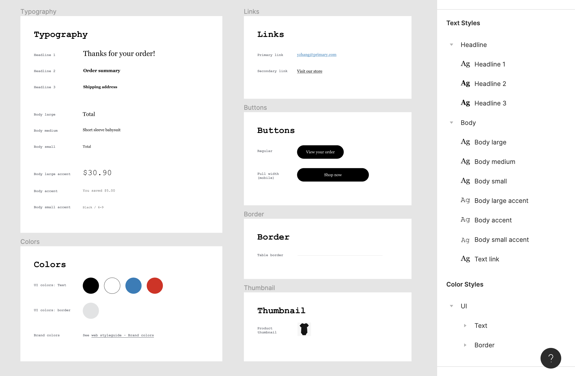
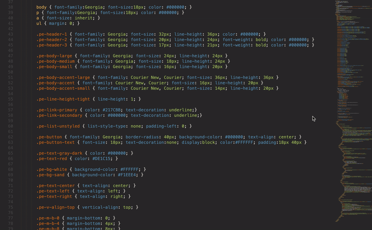
When I was checking Primary's previous transactional email designs, I noticed there wasn't a style guide. The font size and line height of body text occasionally varied from one template to another, and no pattern in spacings could be observed. Considering the relatively large amount of email templates that were going to be designed and built, I decided to create a style guide for transactional emails as the first step.
I started experimenting with type hierarchies, spacings, buttons, and link styles. First, I took copies from the existing email templates to replace the default copies. Then I played with font styles, font sizes, line heights, text alignments, and so on with three email templates: Order confirmation, Gift card confirmation, and Shipping confirmation. These three emails vary in length and complexity, and they cover all the UI styles we might use in transactional emails.
After trying different combinations of header/body style pairings on these three templates, I landed on a short but versatile style guide for our transactional email templates:
To make sure it works on different screen sizes, I tested it on desktop, tablet, and mobile frames. Then I made a few adjustments to header font sizes to make them look not oversized on smaller screens.
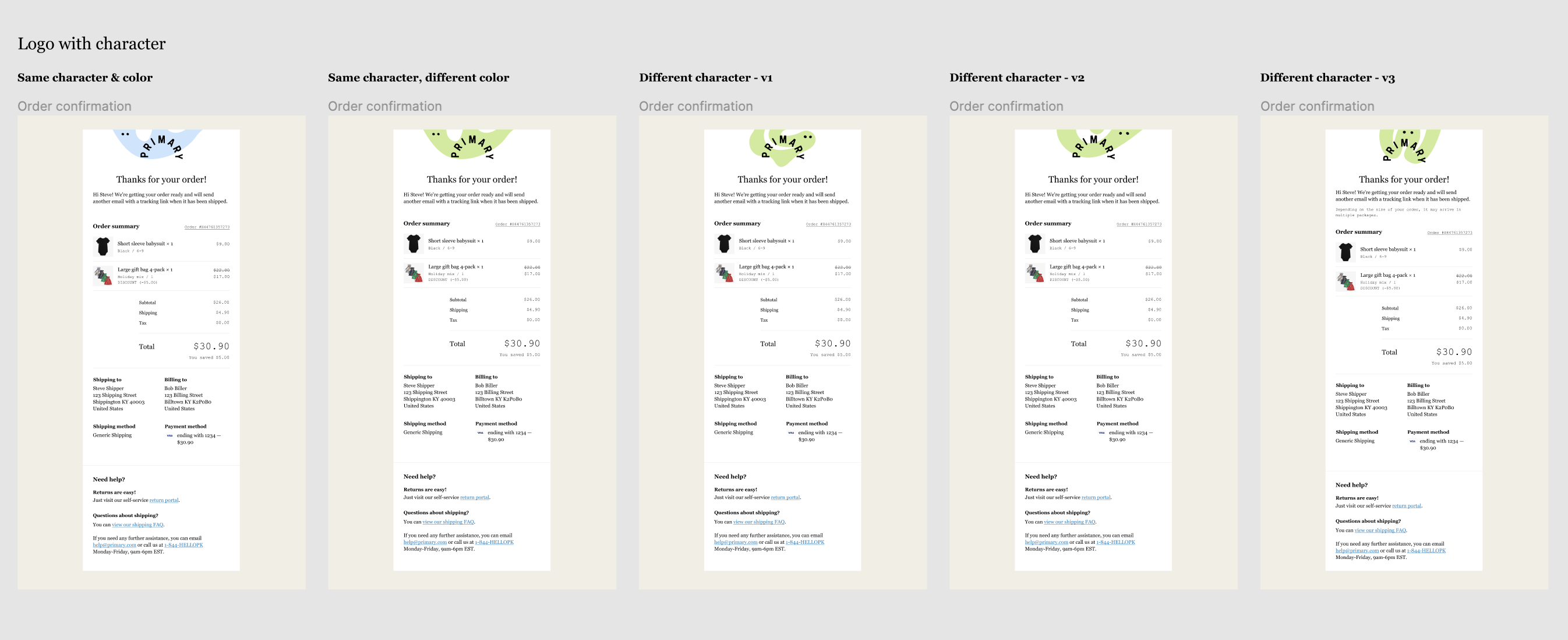
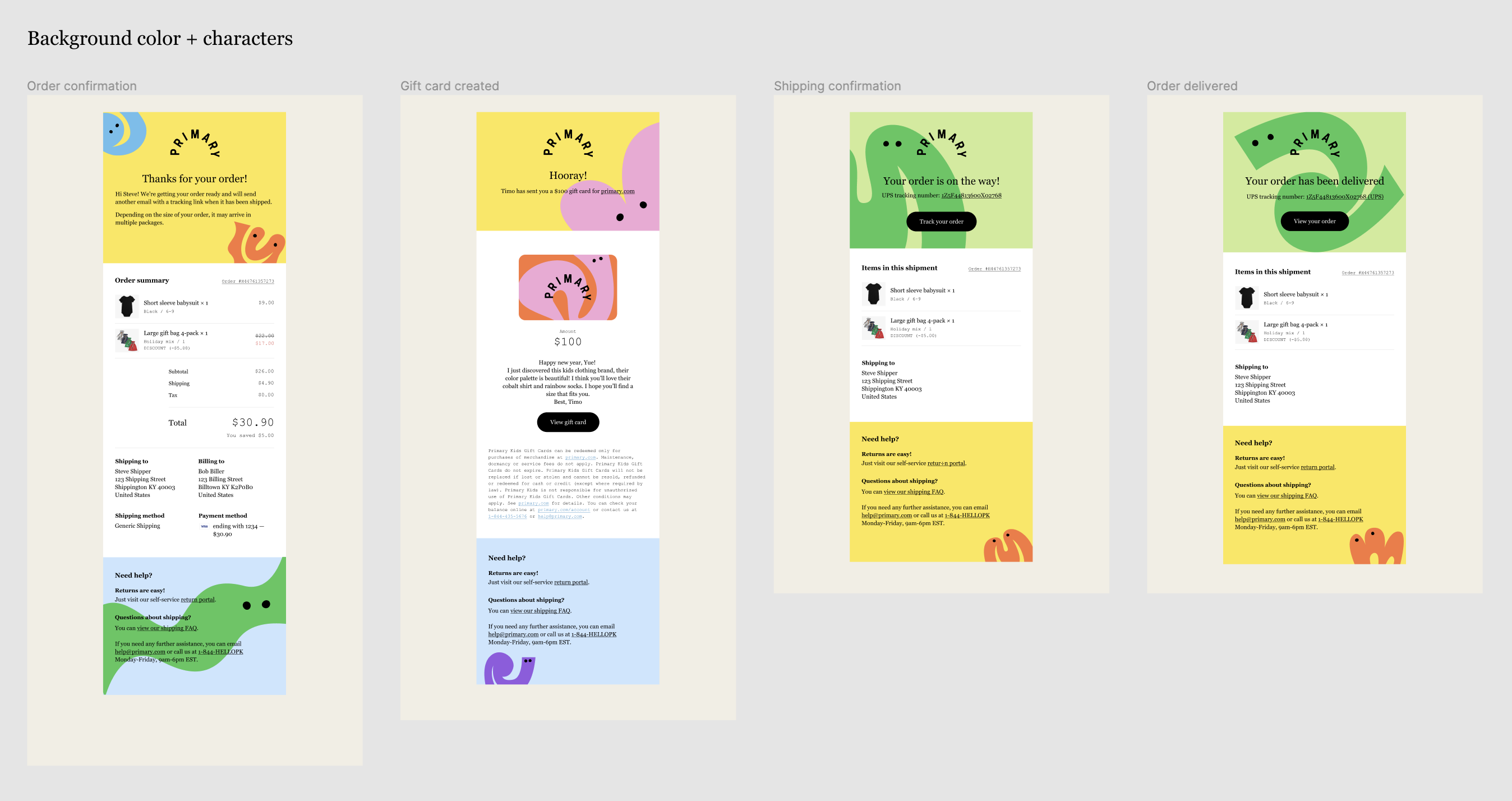
Adding colors
Then it's time to bring in colors and illustrations to these templates. Bold and vivid colors and letter-like illustrations have been essential parts of Primary’s visual identities. You can see them across platforms and forms: websites, packaging, mailers, marketing emails, and social media. In marketing emails, we usually take a bolder approach to the use of colors, where space not taken by photos would be filled with a brand color as the background.
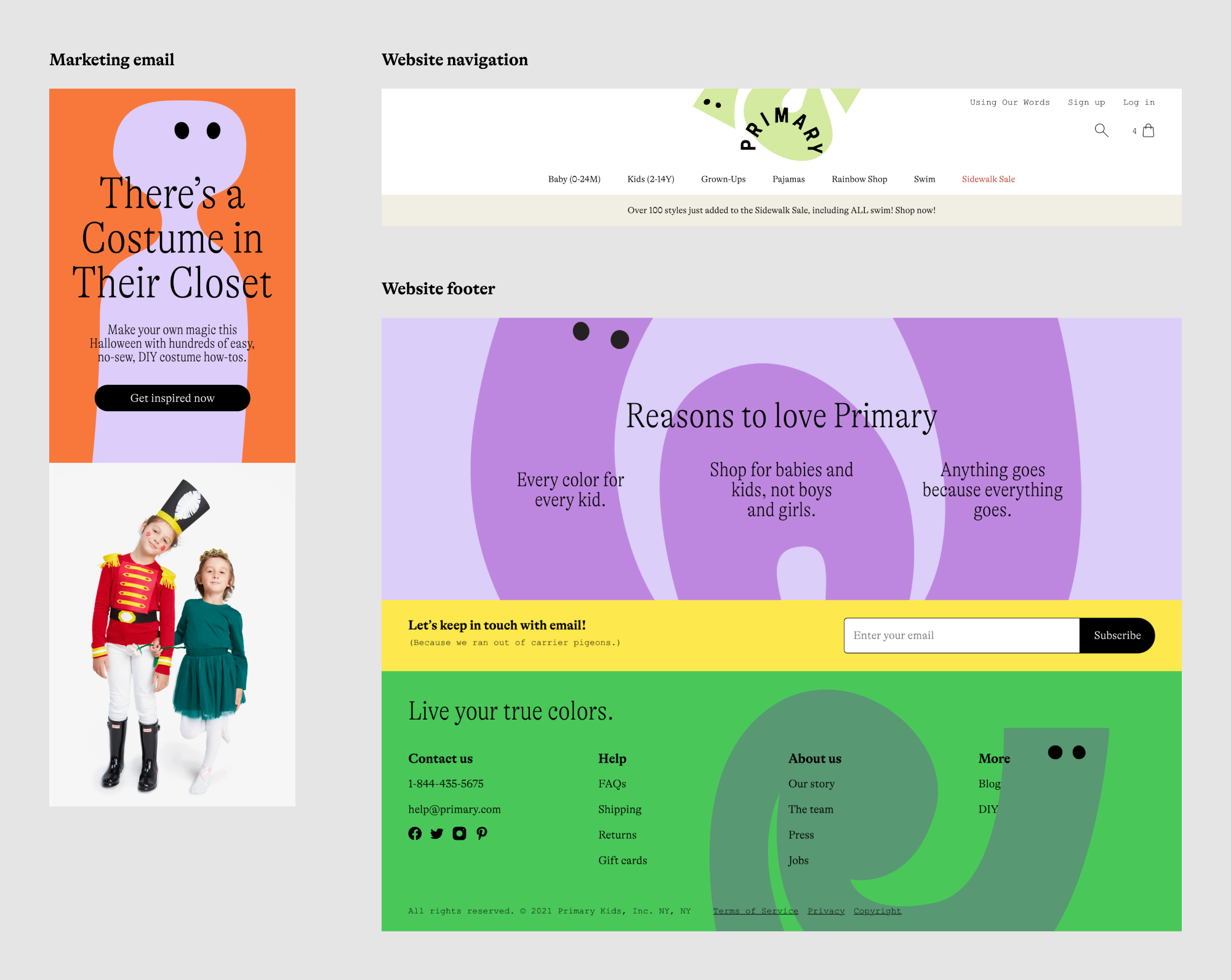
But for transactional emails, colors and illustrations should be used more carefully. There are places where non-neural background colors should be avoided for readability, such as the order summary in the Order confirmation email. Colors, illustrations, and the main content need to be balanced out so that the decorative elements serve the main content instead of competing with it.
I did 4 rounds of design iterations for the tier-1 emails, starting from trying different levels of decorations, to a version where more colors are used as background in the head and footer, then rolled back a bit and limited the number of colors used in each template.
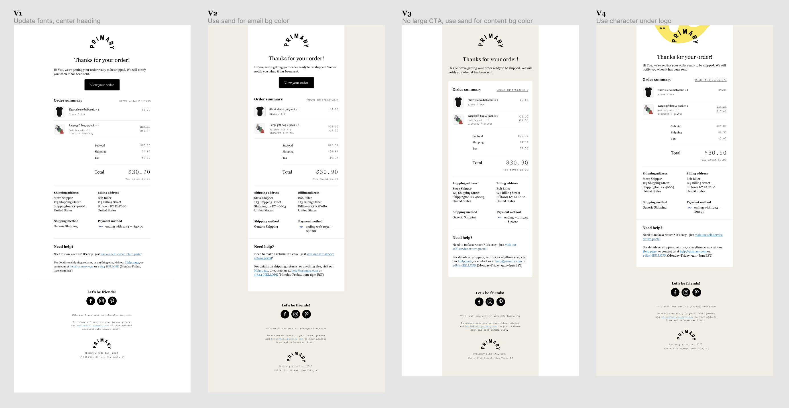
After I landed on iteration 4, the team felt the look and feel of the templates have reached our expectations. So I shared the designs with our email director for her feedback and the Content team for copy reviews.
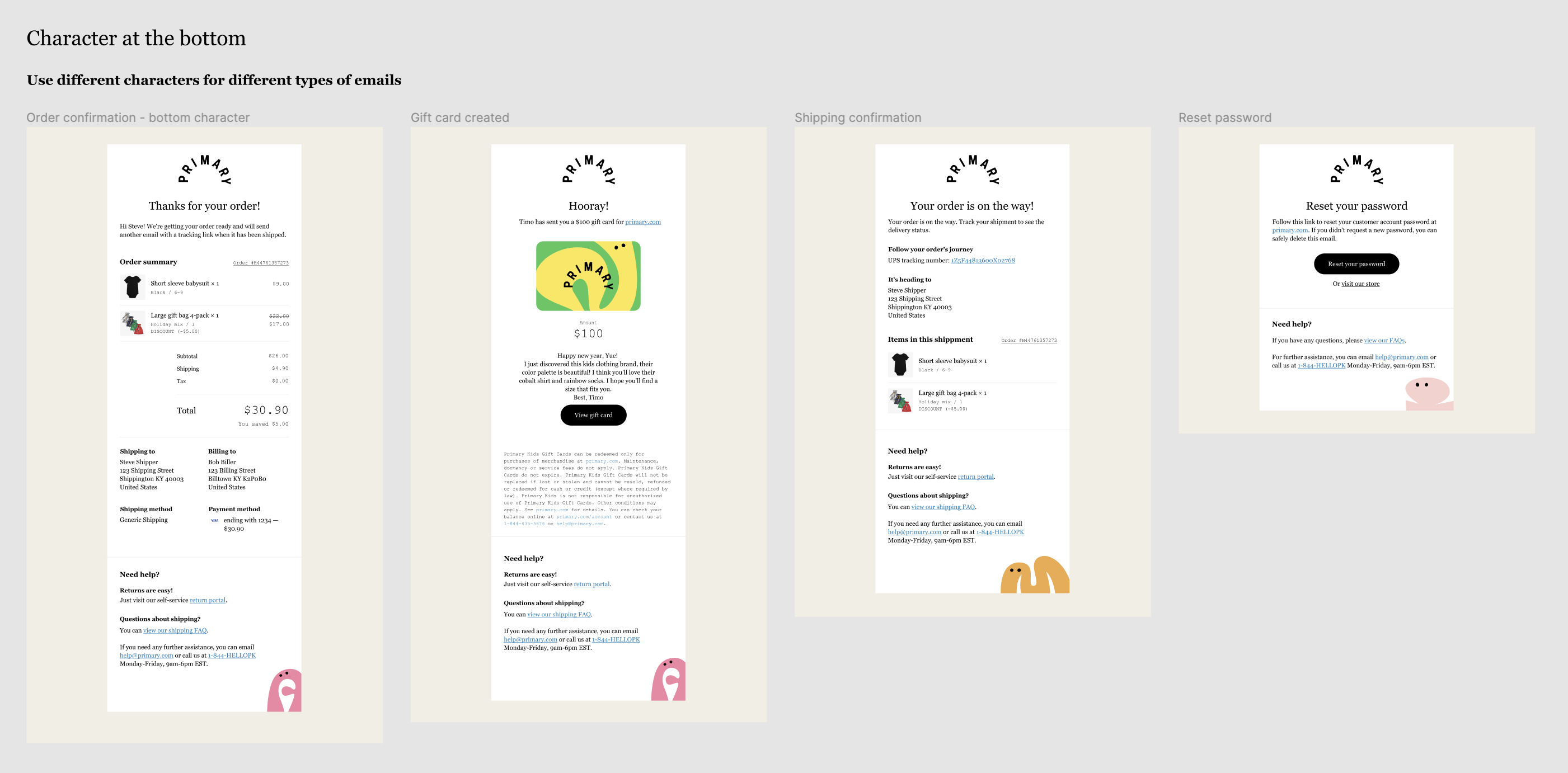
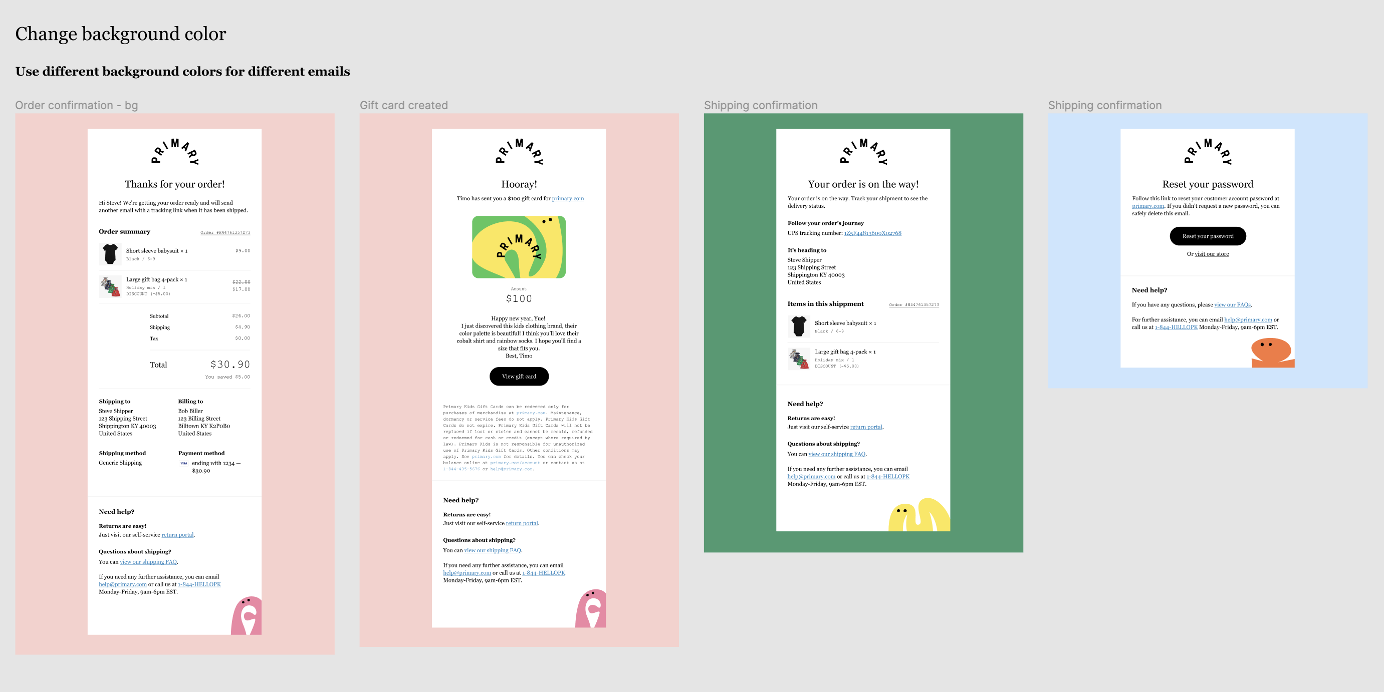
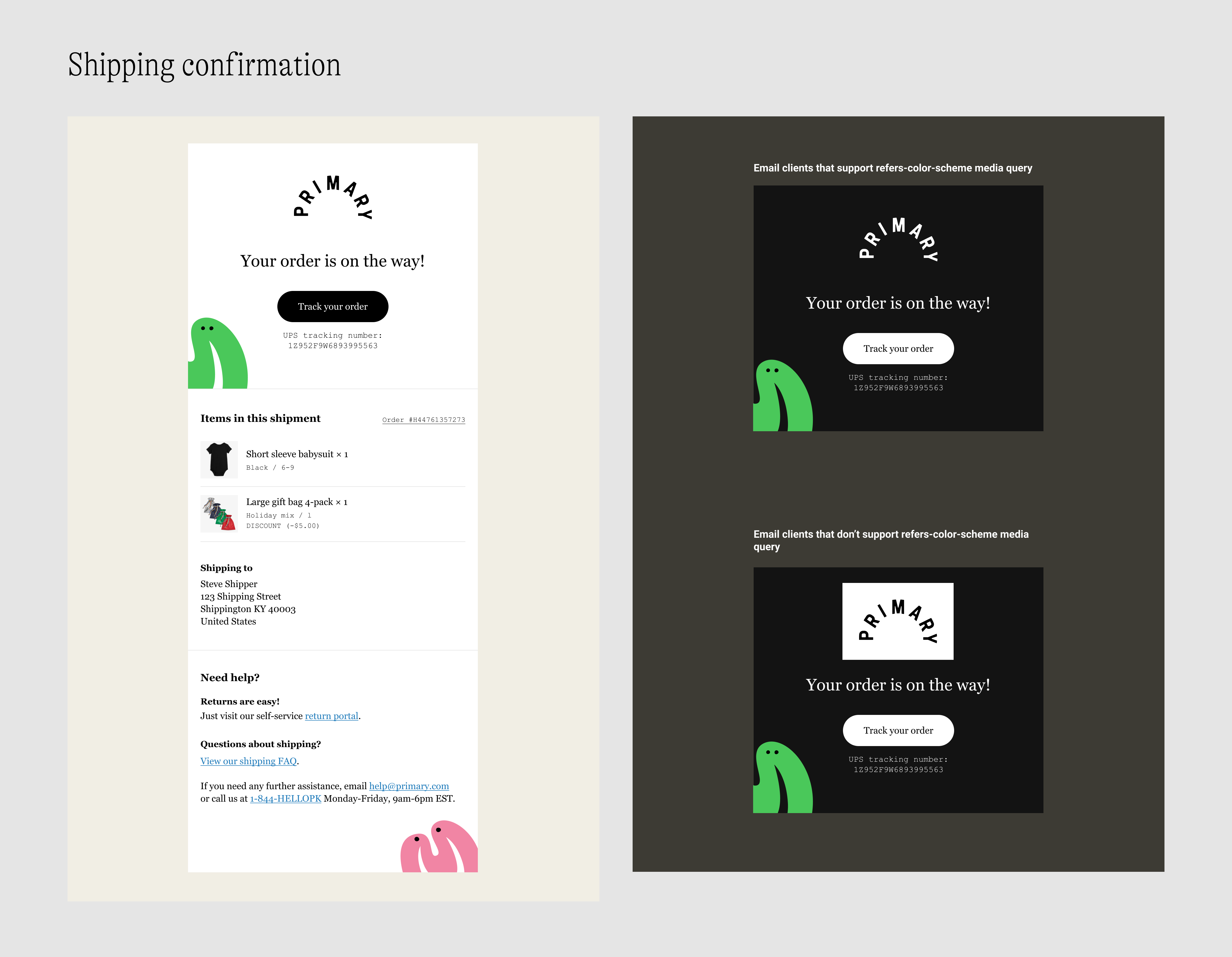
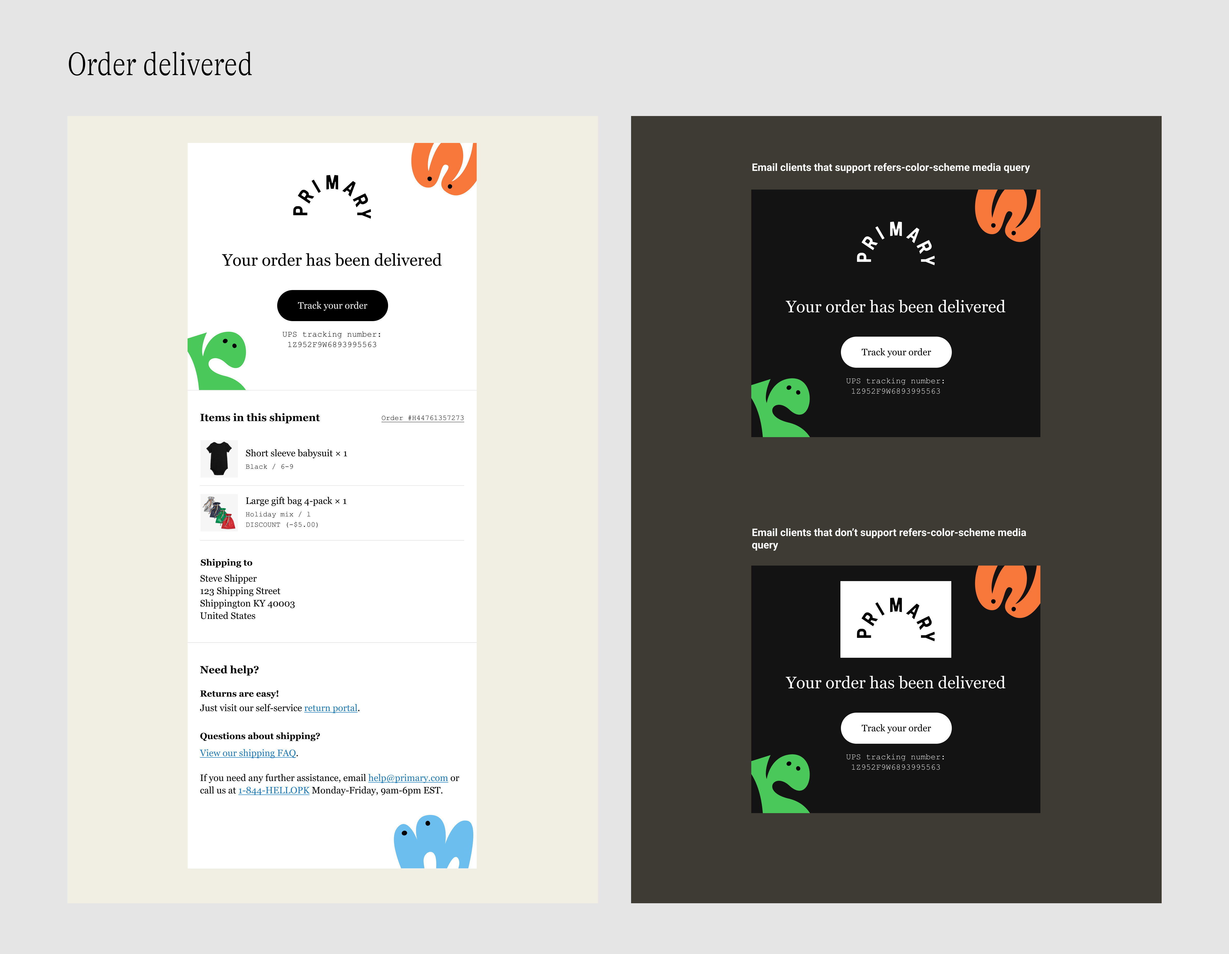
Toning
A piece of feedback I received from our email director surprised me: the designs didn't look as well in the dark mode. The main issue came from the use of non-white background colors. Some email clients automatically darken light background colors for dark mode users and the final outcome is usually out of our control. This "feature" of the email clients not only made it difficult for us to achieve a desired look with non-white background colors, but also made texts that stay on top of illustrations hard to read.
Another issue was that the black logo with transparent background became almost invisible in the dark mode. Besides, the red color used for discount prices did not pass color contrast test in some email clients.
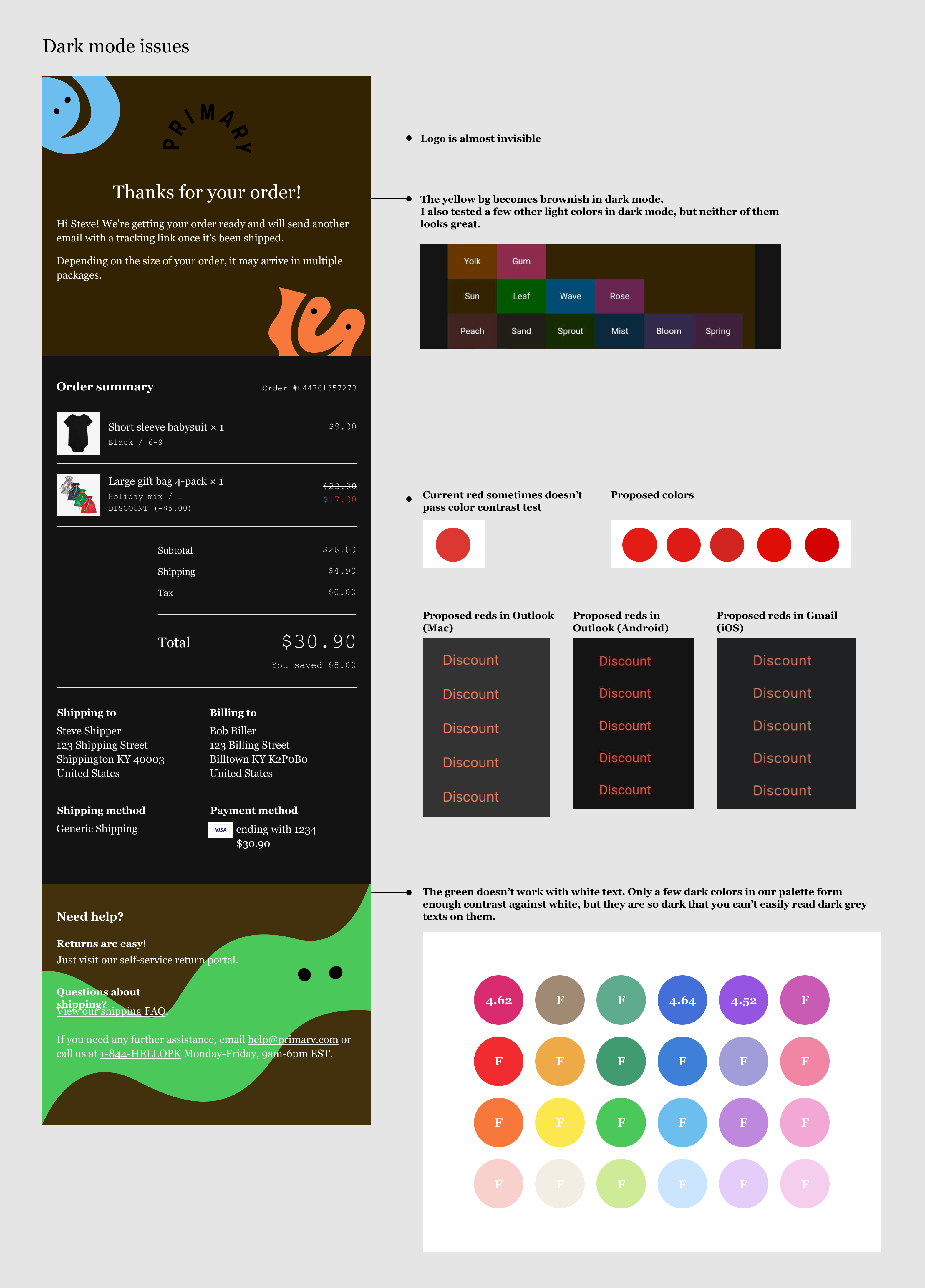
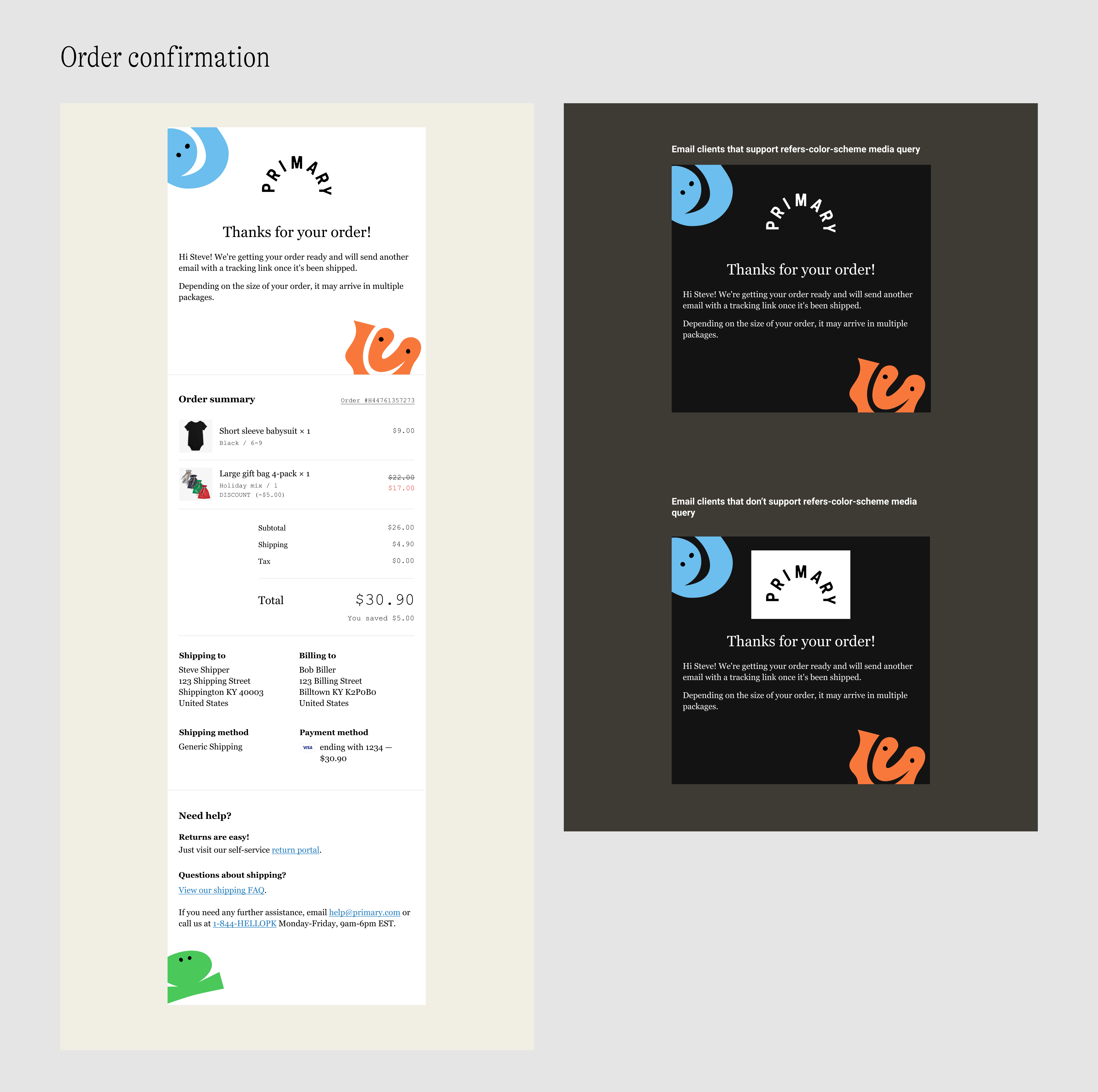
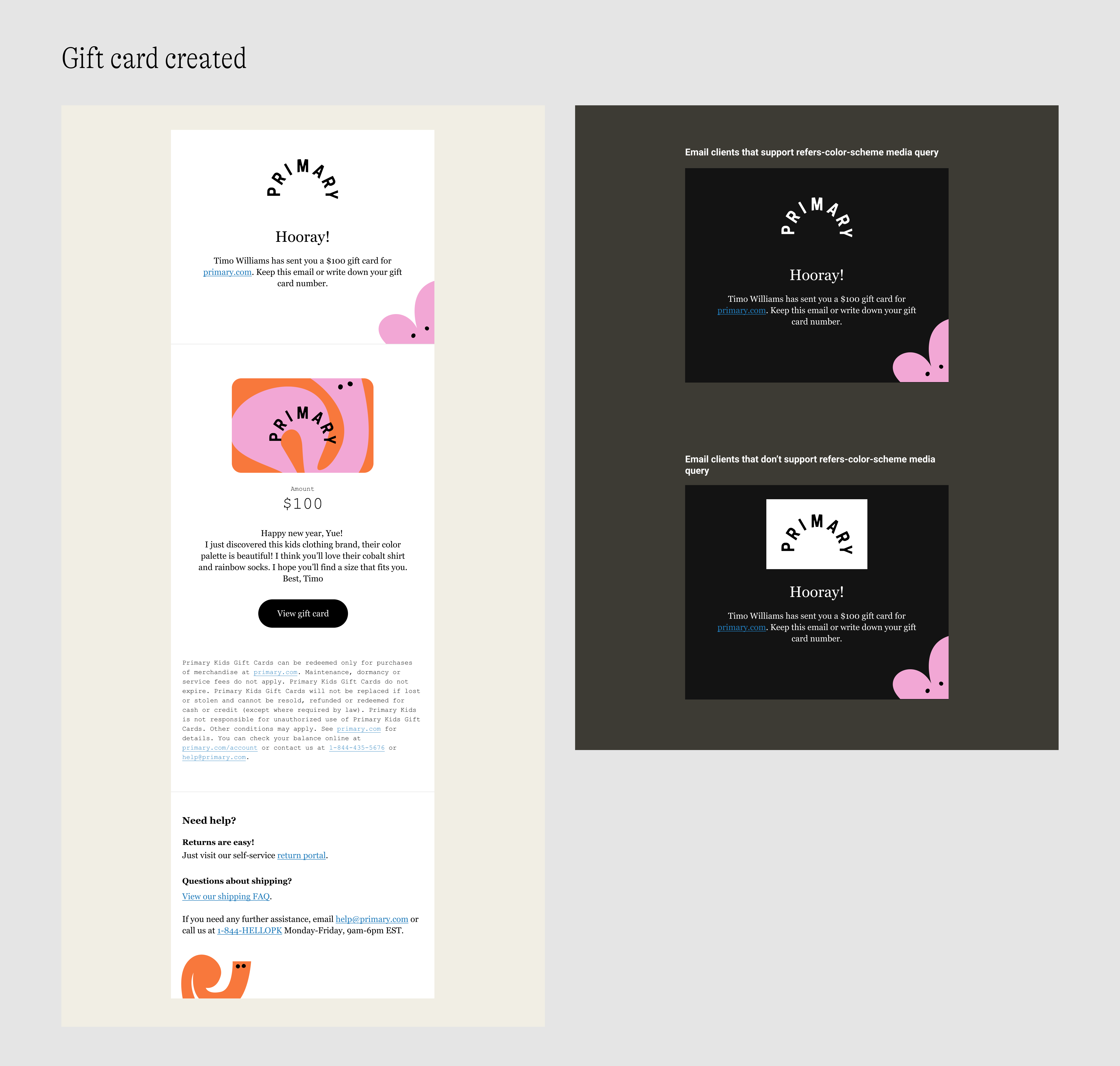
We didn’t know the exact percentage of users who use dark mode when reading emails, but according to Litmus, 36% percent of iPhone users use dark mode on their phones, and a growing number of email clients are offering a dark theme for those who prefer a dark interface. To make sure our design looks great in different modes, we decided to take out the colorful backgrounds in the templates and use a white background instead.
For the logo displayed in dark mode, we decided to do two things: use a white logo for email clients that support dark mode media query; for those that don’t support dark mode customization, use the black logo on a white background so that the logo is always visible to customers.
Build
Mirroring: From Figma to CSS
As mentioned, I created a style guide before I started designing the email templates. Similarly, the first step I took when building the templates was to translate the visual style guide in Figma to CSS. This was useful because Shopify would inline any style tags in the template, which means you can define your styles in a stylesheet in the <head> of a template, then use the custom classes in the <body> as needed.
After the translation was completed, I tested the classes with the Order Confirmation email template. In this process, I also added some utility classes to the library to make it more comprehensive.
Building for real life
There were some discrepancies between Shopify’s default order confirmation email template and the email we want to deliver to customers in terms of the information shown in the receipt. To name a few:
- We wanted to hide the third variant metafield in the template.
- We wanted to show gift card recipient information and gift card message in the email if the order contains gift cards.
- If customer added a gift note with their order, we wanted to show that message in the email.
- We also noticed the order summary has a different structure from the receipt shown on the order status page in some scenarios. We would like to update the code to make sure there is a nice consistency in order summary from checkout pages to confirmation email.
Luckily, most of the hiding/showing jobs have been done elsewhere across the site, so I just needed to find examples of how engineers have done it and tweak the code to make it work on the email template.
To test the output of the confirmation email, I created several dummy orders that covered all the possible order types:
- Order content: Just physical products / Just gift cards / Physical products and gift cards / Special products (e.g. masks)
- Price: Full price / Sale price / Bundle price / Discount code
- Order notes: Gift message
- Payment method: Credit card / Gift card credit / Credit card and gift card credit
- Refund
This process was quite time-consuming but it was really fulfilling when everything was finally working nicely.
Cross-client testing
Another huge challenge was to ensure the email to look nice in different email clients and color themes. Till this point, I had only viewed the confirmation email in the Gmail web app on Mac. I thought it wouldn't look too far in other email clients, but I was so wrong.
I learned from our email director that among our customers, Apple mail on iPhone was the most popular email client, followed by Gmail web and Gmail app on android and iOS. When doing email testing, it is important we make sure our emails look good in these major clients, and it’s also a good idea to test the less used clients for the best experience (e.g. Outlook, Apple Mail on iPad, and Yahoo mail).
I used Litmus to run testing for the templates. The testing process was simple, as all I needed to do was to send a test email to our Litmus account to check the auto-generated preview for each client. Then I would fix the issues, test again, and repeat until an ideal result is achived.
The process required a lot of patience and sometimes things would get tricky. I had to keep reminding myself that in the email world, sometimes it’s impossible to make things look perfect. Be practical and make sure that the template works and looks good for 95% of the targeted clients, and that it functions properly and looks acceptable for the remaining 5%.
Dark mode
After some research, I learned that there were two common methods to customize email template for dark mode:
- Media query @media (prefers-color-scheme: dark)
- The media query can be used to detect whether the user prefers a light or dark theme and display the right design in response to the chosen color mode. It has nice support on the latest iOS and macOS device. Detailed support data can be found on caniemail.
- Conditional CSS and [data-ogsc]
- They are used for creating styles that target Outlook apps. The basic idea is to use conditional CSS to target the Outlook apps and use the [data-ogsc] selector to control styles like color, background color of selected elements.
What I learned
Email design is a lot different from website design because there are more limitations in email implementation and that requires you to take all of those limitations into consideration when designing for emails. It would be wrong to assume you can just apply what is possible in the web world to the emails and things will work perfectly. Yes, email templates are built with HTML and CSS, but the same markups and properties sometimes don't get interpreted the same way by some clients.
If it's your first time building a set of email templates, be prepared to spend more time than expected on testing! There could be situations where changing a few lines of code fix a bug in one client and ruins another. Just be patient and try different approaches.
Looking back at the process, the best decision I made was to create a style guide for the email templates before doing anything else. It saved me a lot of time and effort during the whole design and implementation process. Having a style guide in code also made it easy to maintain the templates.
On the other side, there was one thing I wish I had done: asking the marketing email director for design feedback earlier. If I had known the limitations around the use of background colors and characters, maybe we could have landed on the final version earlier.
It was a great learning process working on this project. I was very proud to see these templates go live. Knowing tens of thousands of customers are receiving emails I designed & built makes a good amount of joy I can take in every day.
Next project: Size Filter | Primary >>