Color Stories | Primary
Envisioned a new way to shop for clothes on a web page. Increased conversion rate by 63%.
06/2023 - 08/2023
1 Product Designer (me)
2 Software Engineers
Project Manager
SVP of eCommerce
Merchandising team
Photo Art Director
Senior Content Manager
Market Research
UX/UI Design
Visual QA
Figma
Liquid
SASS
Javascript
As the sole Product Designer on this project, I closely collaborated with key stakeholders on designing and implementing a new template that is now utilized for each season's new arrivals rollout. I provided strategies to realize our vision for the new experience through market research, translated business objectives into a responsive web design through three design iterations, and drove cross-functional alignment to ensure delivery of the final design within four weeks.
The Problem
Primary is a kids' clothing brand that makes essential, sustainable, and gender-neutral clothes in a rainbow of colors for babies and kids. Primary believes there’s a color for every kid and is proud of its expansive color options offered to its customers.
In 2023, the team wanted to create a new experience where customers could immerse themselves in a color-themed space, get inspired by the curated outfits, and purchase products from a collection hand-picked by the team. However, none of the existing page templates allowed us to fulfill these visions. A new template was needed.
The Goals
The high-level goal for the project was to build a color-themed template that allows the team to showcase specific styles and highlight the versatility of our products. We hoped that by inspiring customers with outfit examples and providing them with curated products, we could stimulate their purchase intent, and therefore increase customer engagement and purchases.
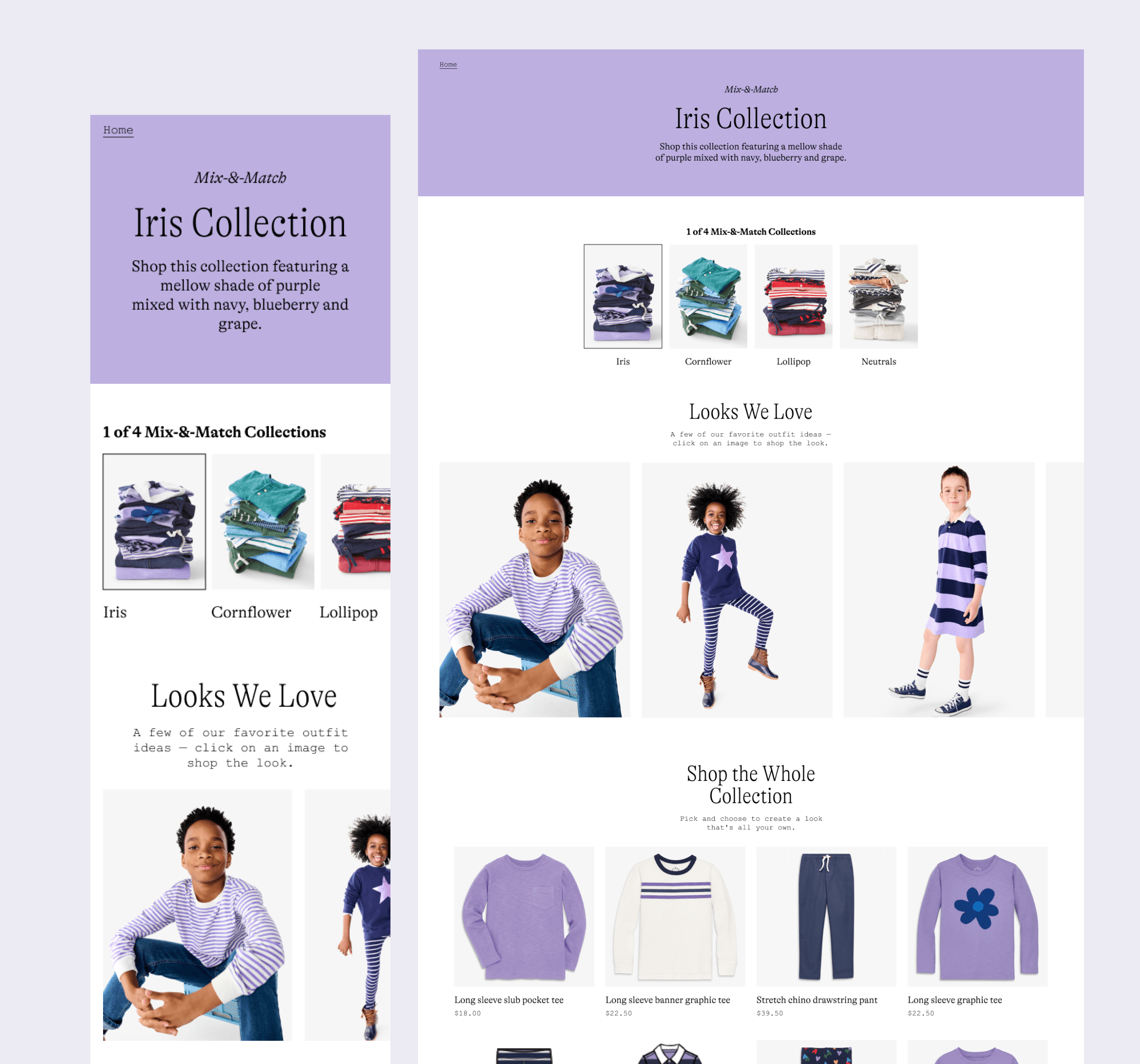
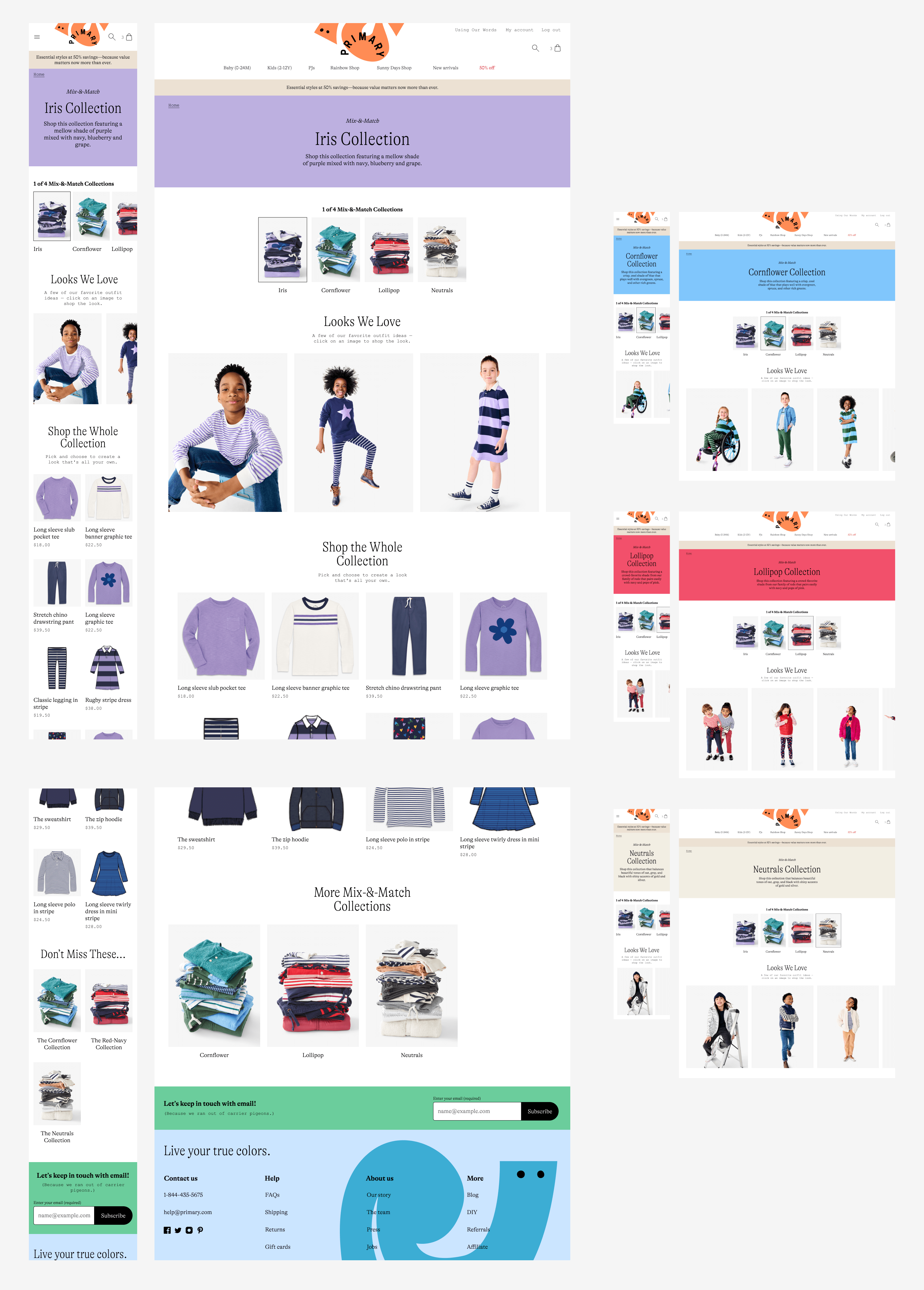
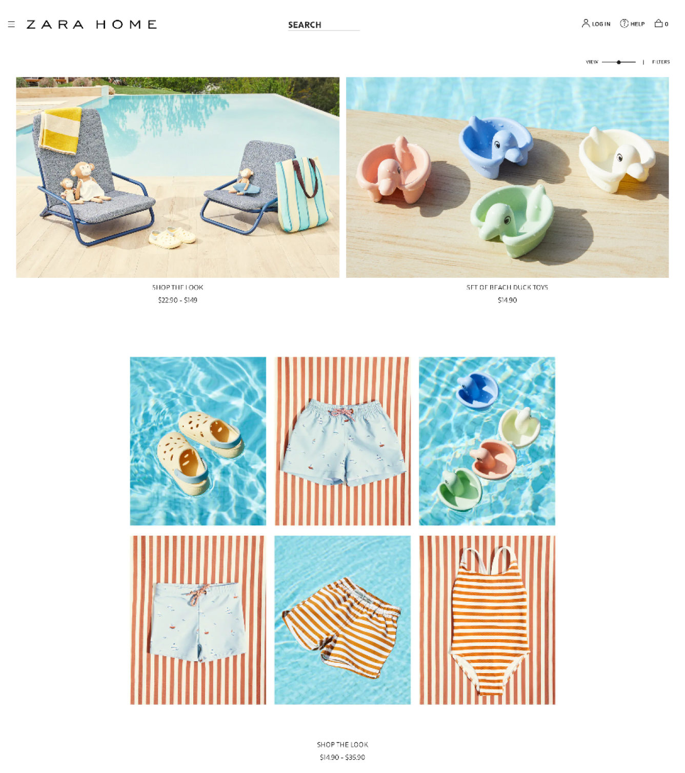
The Solution
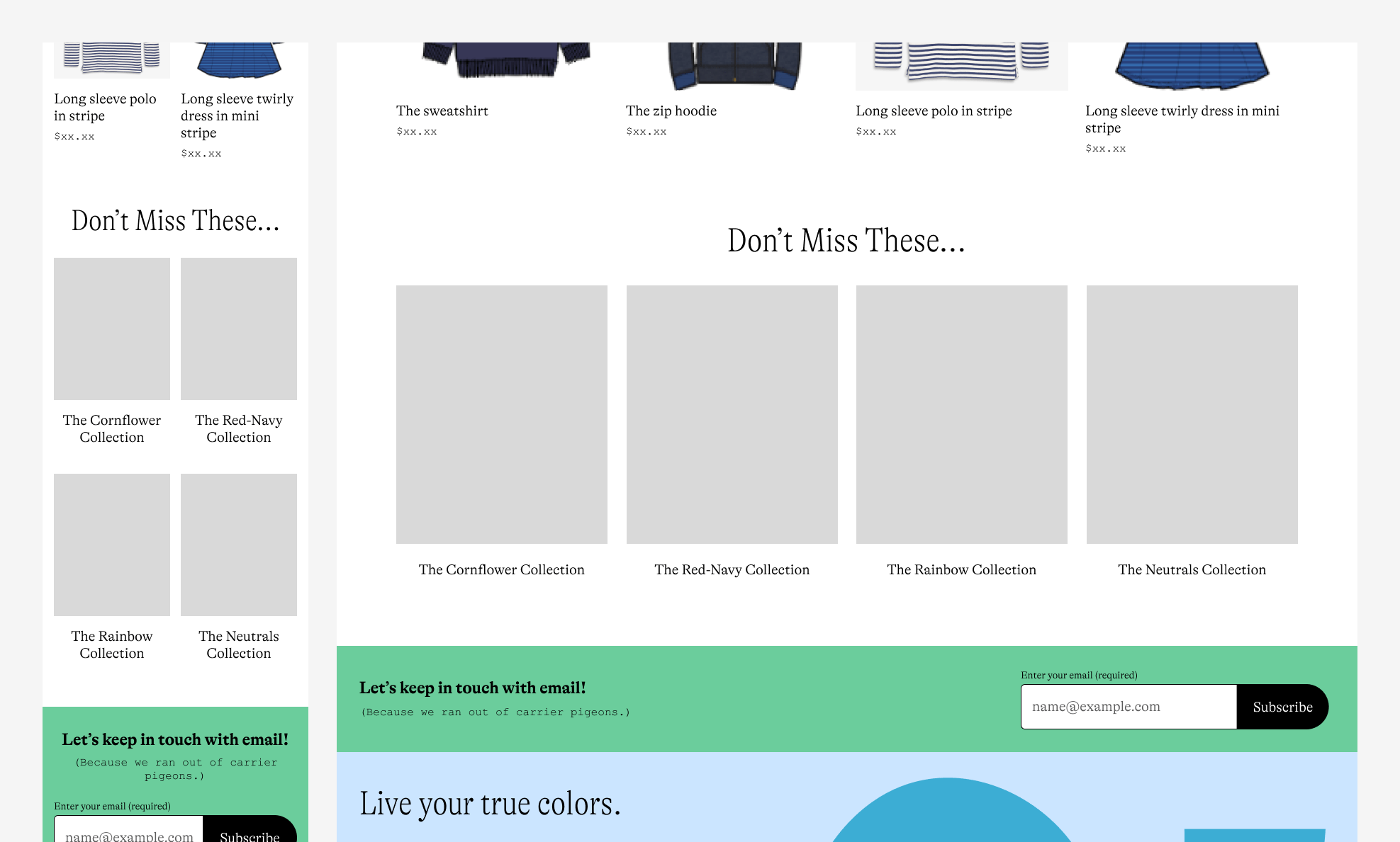
A customizable page template was designed and built for Primary to showcase new color collections. The team can now present outfitting ideas in an image carousel and provide a grid of curated products for customers to browse and purchase. Additionally, links at the top and bottom of the template enable customers to explore other color-themed collections they may find intriguing.
The Outcome
The four Color Story pages were launched in August, 2023. The new page template allowed the team to present our new assortments in different color themes, creating a very on-brand and fresh shopping experience for our customers.
Overall, visiting Color Story pages had a positive impact on order economics. For sessions that visited a Color Story page:
- Conversion rate increased by 63%
- Units Per Transaction (UPT) increased by 6%
- Average Order Value (AOV) increased by 23%
Research
I connected with the merchandising team who initiated the idea of Color Stories. They had a clear vision of how products are organized on the page, and they wanted to showcase a set of outfit examples as inspirations for creating outfits. At the same time, there was a special interest in being able to intersperse content (static images, text over images, customer reviews, etc.) throughout the page. They also suggested that a size filter would be nice to have since they were planning to include both baby products and kid products on the same page.
While the idea of Color Stories was original, it related to a more common sales strategy—mix-and-match. So I conducted a market research to study how other businesses are selling their mix-and-match collections and to seek inspiration for featuring outfits in conjunction with products.
Learnings from the market
After going through over 60 e-commerce sites, I was only able to find five live examples. Even though the sample size was very small, I was able to summarize the strategies utilized on the pages:
- Strategy 1: Leading a small collection of products with multiple lifestyle images showcasing possible outfits that can be created using products from the small collection.
- Strategy 2: Showcasing all featured outfits at the top of the page, then presenting a small collection of products with a card that links to the page where customers can shop the small collection.
- Strategy 3: Instead of displaying individual product cards, grouping products that belong to the same “outfit idea” in one image. The image links to a page where all the products in the image can be selected and purchased.
Since none of these examples had custom content inserted throughout the page, I made a separate observation on traditional product listing pages in the market. The key takeaways were:
- Content blocks can be used to lead a group of products by highlighting features of the products. They are often used to cross-link to a different page, in which case the block is inserted on either side of the product grid.
- The first content block is usually placed within the first 3 rows in a product grid on desktop.
- Most content blocks are designed to have the same size as a product card so that they don’t take away too much space from the products.
- Blocks placed irregularly can be confusing because they make the page structure unclear.
- Embedding text in an image is a bad idea because the text would be illegible on mobile, and it would cause accessibility issues.
Design Iterations
The market research provided great ideas for structuring the page. Strategy 1 and 2 were the two logical ways for arranging outfit photography and products on a page. Strategy 3 required too much lift for the photo team and the tech team, and was not something we were looking to try in this project.
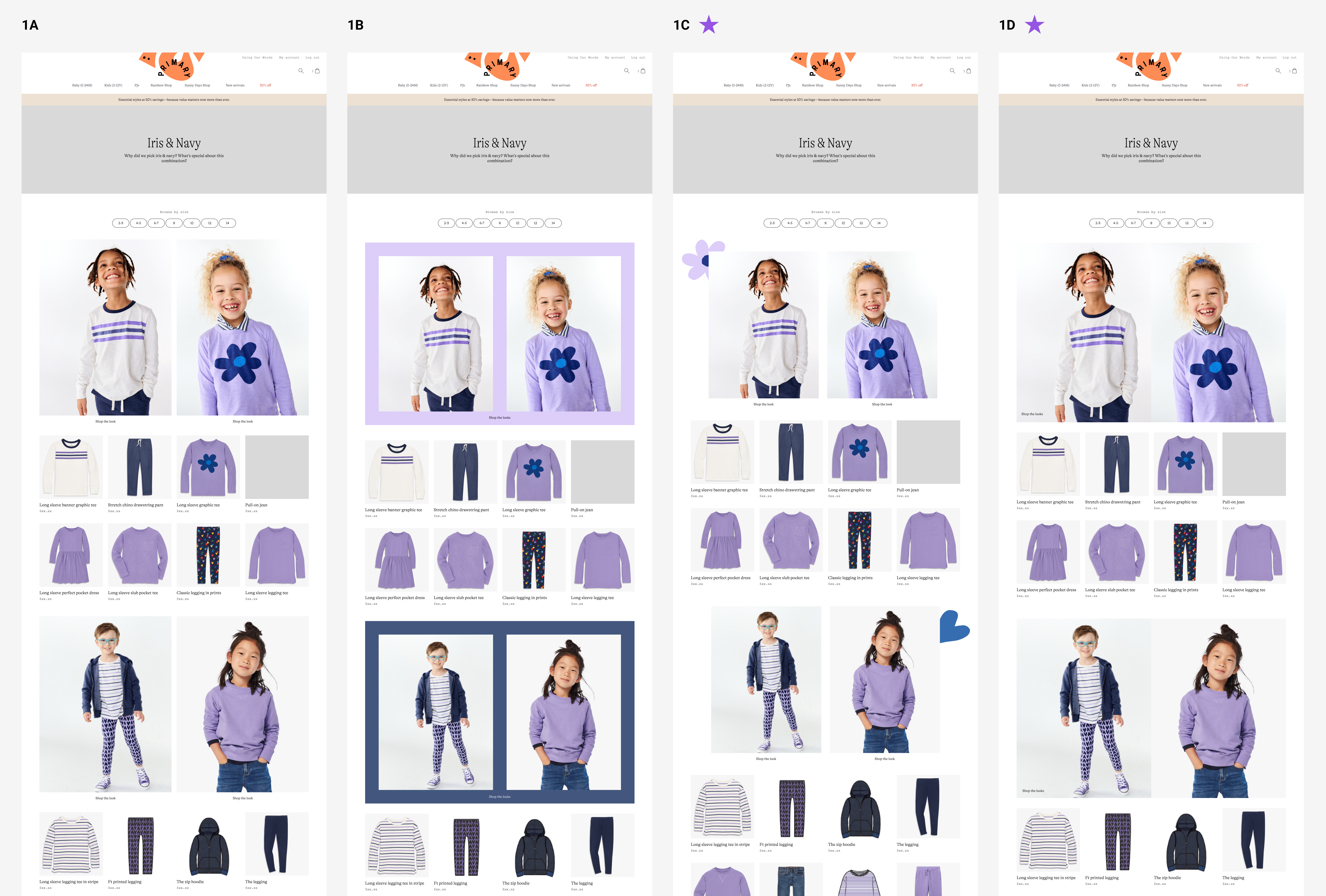
Iteration 1 and 2 - Page layout
After aligning with the core group regarding the views on the three ideas mentioned above, I began sketching out the page layout options using the assets that were available to me at the time while taking consideration of the need to insert custom content throughout the page.
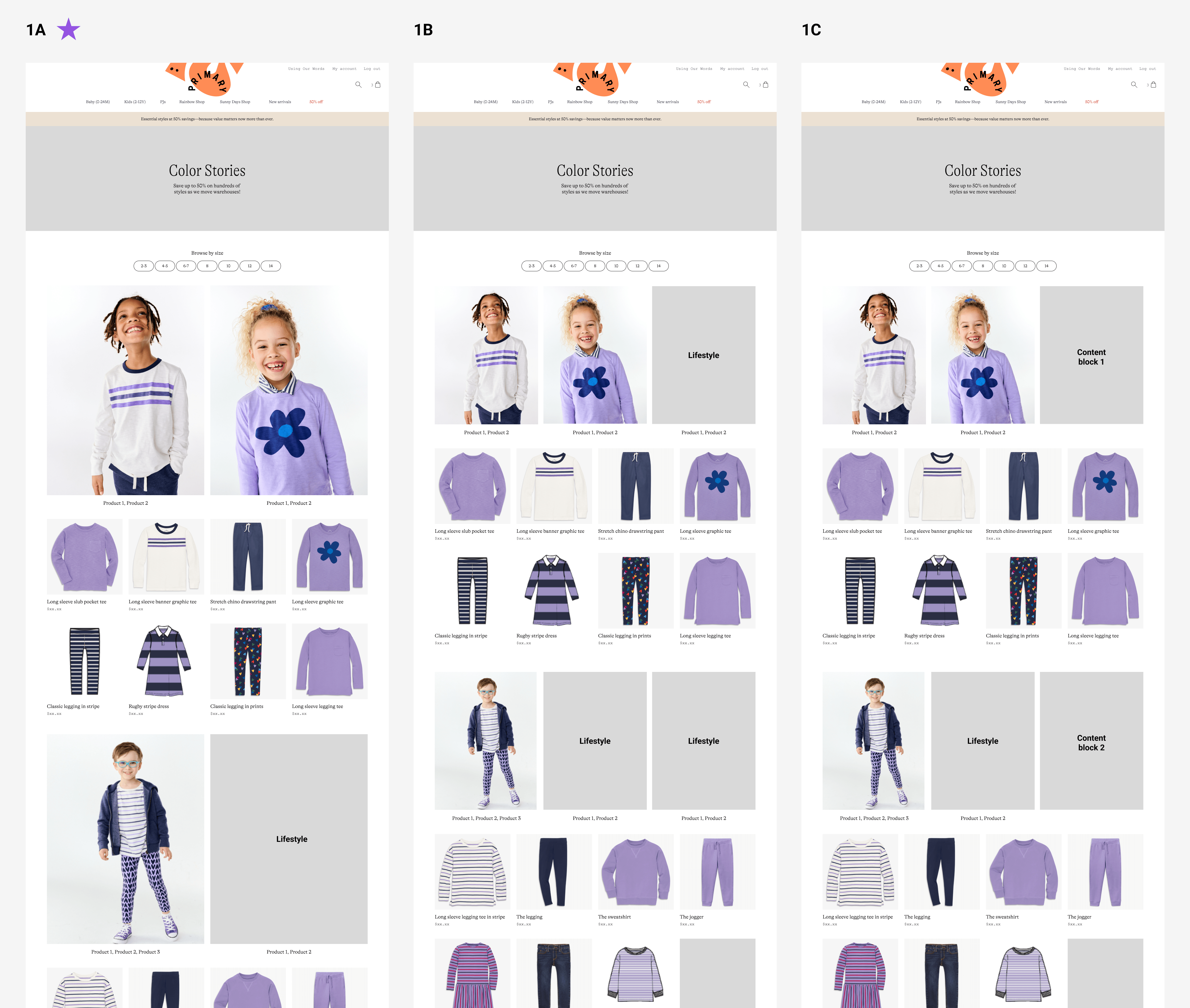
I shared these explorations with the core group over Slack, and the group found both directions interesting:
- Option 1A was preferred among the layout 1 variations due to the clear distinction between outfits and products. The group was interested in seeing further explorations where the outfits stand out more.
- Option 2A was preferred between the two layout 2 variations, and the group was curious about other ways to present outfit ideas.
While I was exploring the page layout options, I had a difficult time finding a home for content blocks. The main reason was that the pages already felt structurally complete, and inserting extra content into the products grid would hurt the cleaness and the scanability of the products section.
I shared the above thought with the core group and we had a discussion. As a result, the team decided to remove the requirement of being able to insert content blocks for this project. We felt that for the MVP, content blocks weren't part of the core experience, and it was something we would be interested in exploring after we validate the idea of Color Stories. We also felt that we would like to test content blocks in a larger venue (i.e., the regular product listing pages) so that we could run tests more efficiently.
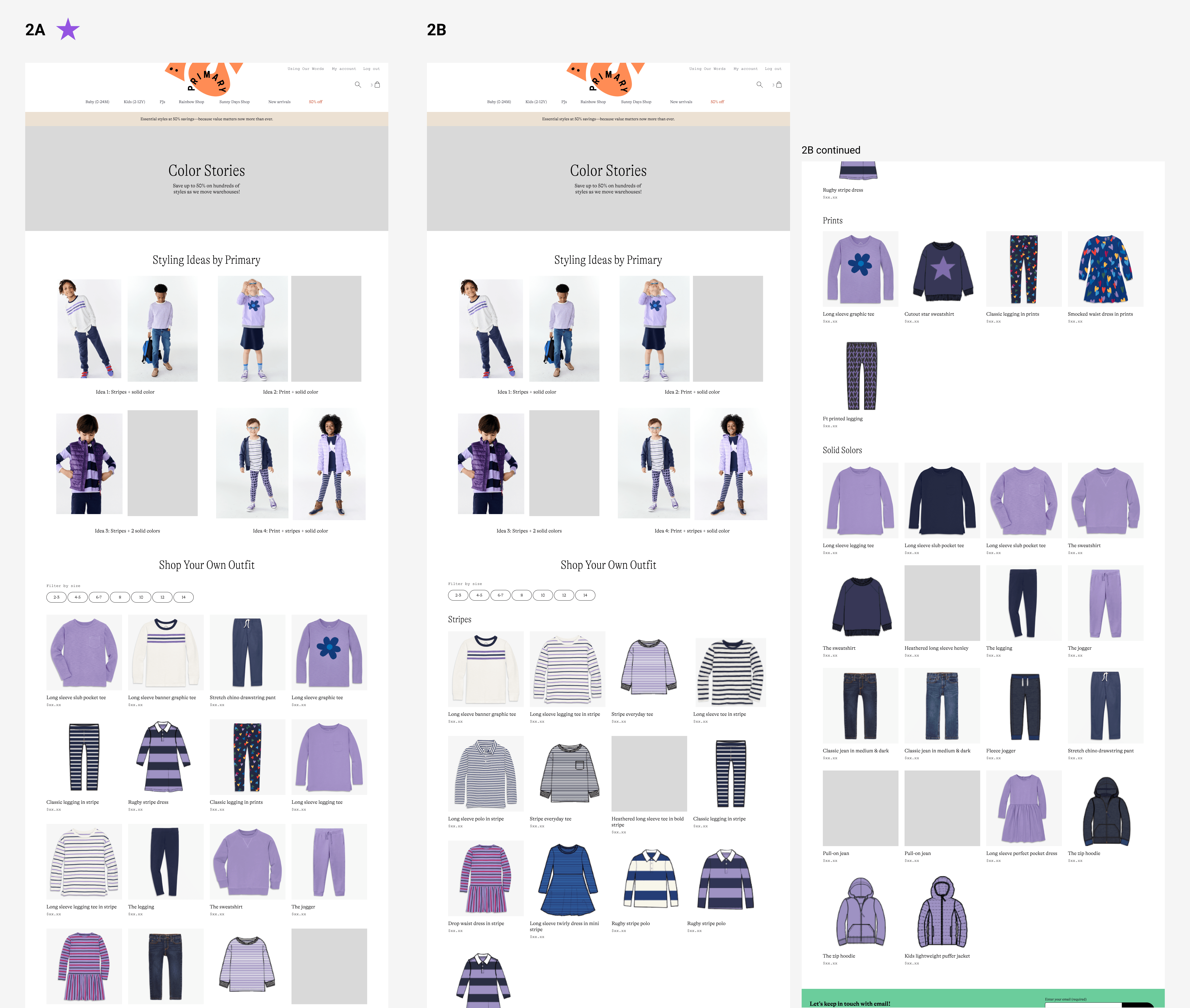
Based on the feedback, I conducted a second design iteration to expand on ideas 1A and 2A.
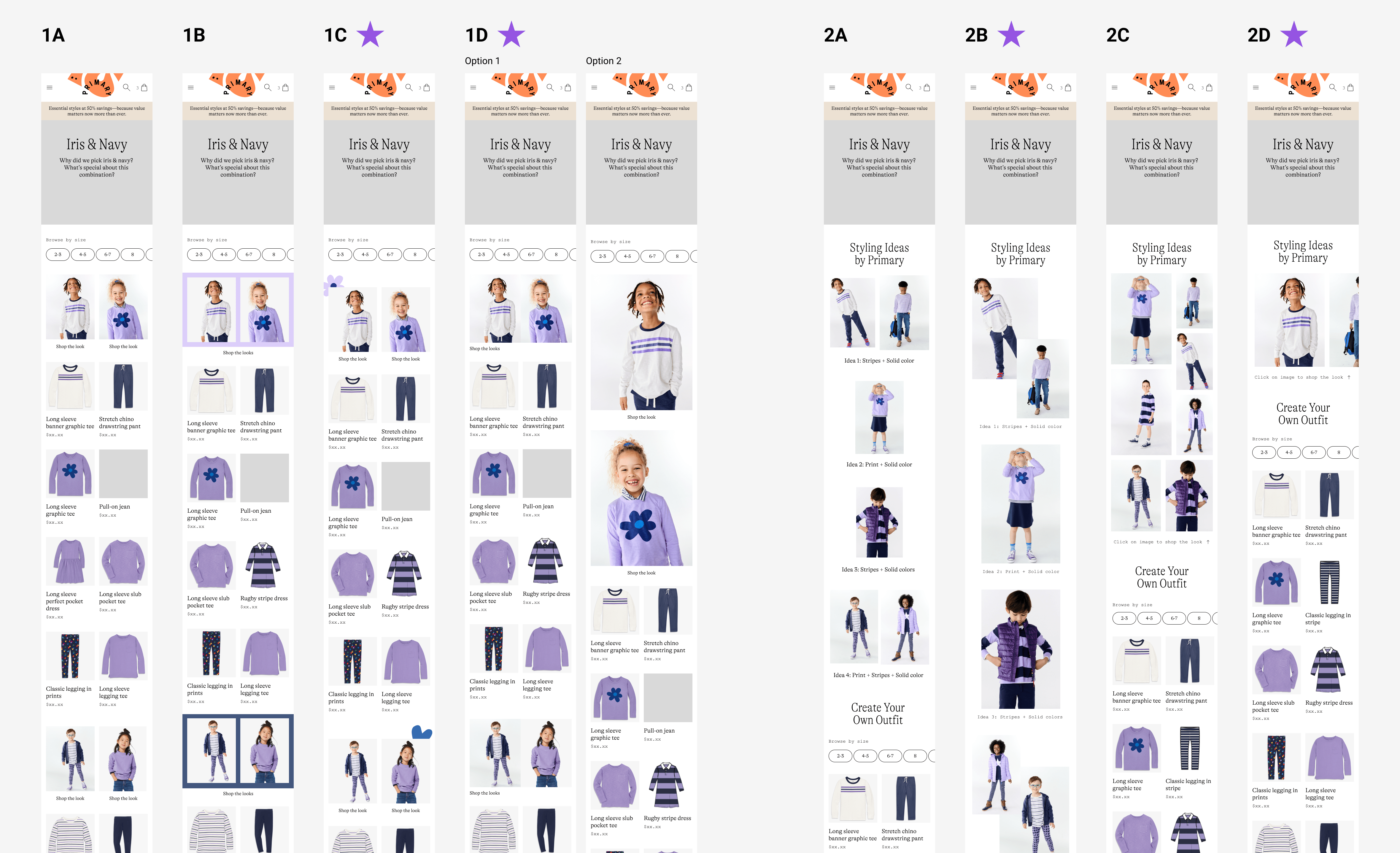
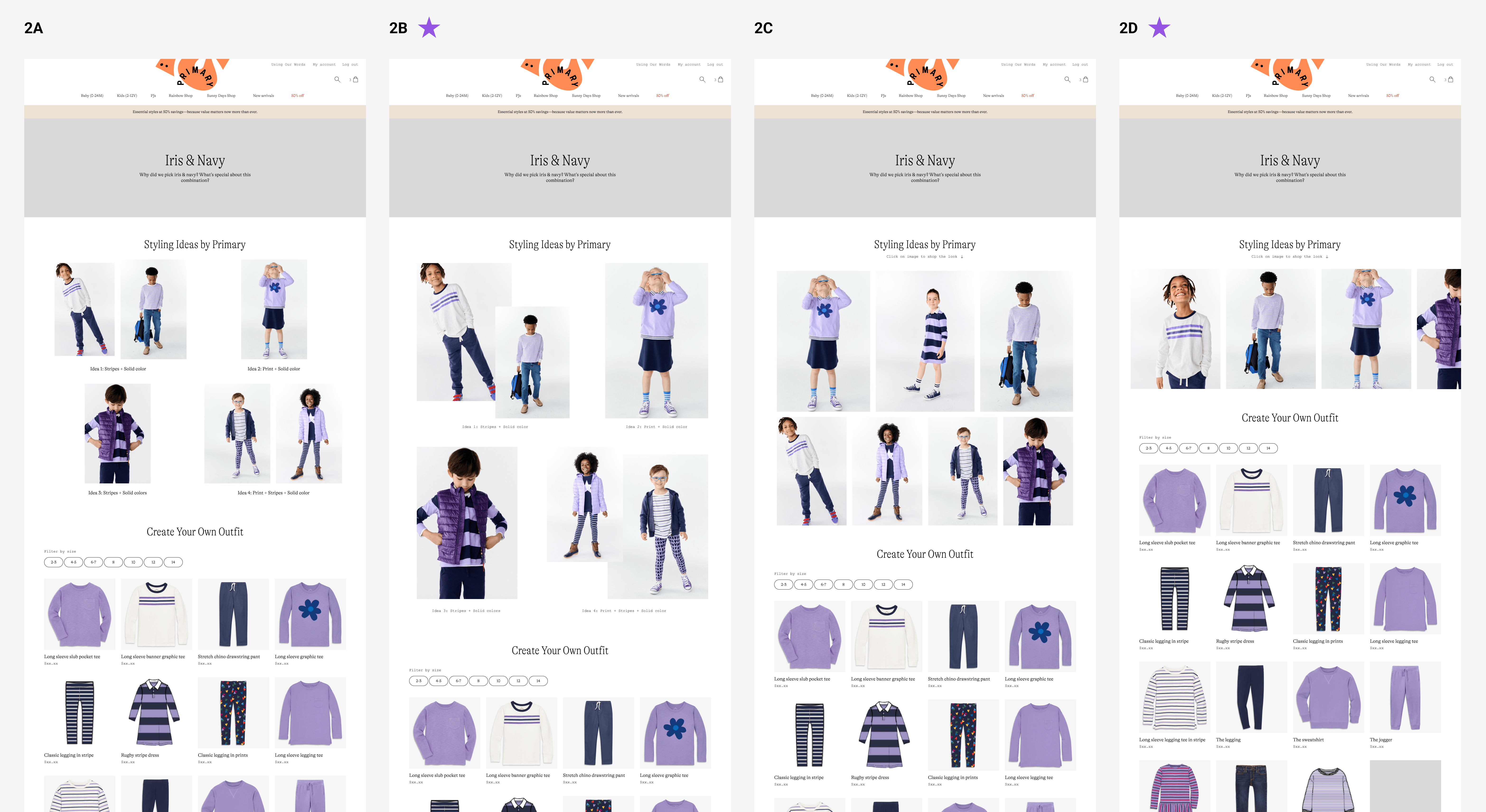
The team found options 1C, 1D, 2B, and 2D were promising. Therefore, I presented these four options to the key stakeholders in our first Design Review meeting. Coming out of the meeting, the team aligned on proceeding with option 2D for its clearity and simplicity, as it allows exploration via outfit carousel while taking customers to the shoppable products faster.
Iteration 3 - Make other stories more visible
One piece of feedback from the Design Review meeting was that it would be helpful to incorporate links to other Color Story pages in the header area. I explored different options using our existing components from the style library. While it wasn't a request, I suggested that we also add links to other Color Stories at the bottom of the page so that people who missed the links at the top can have a second chance to notice the existence of other color stories.
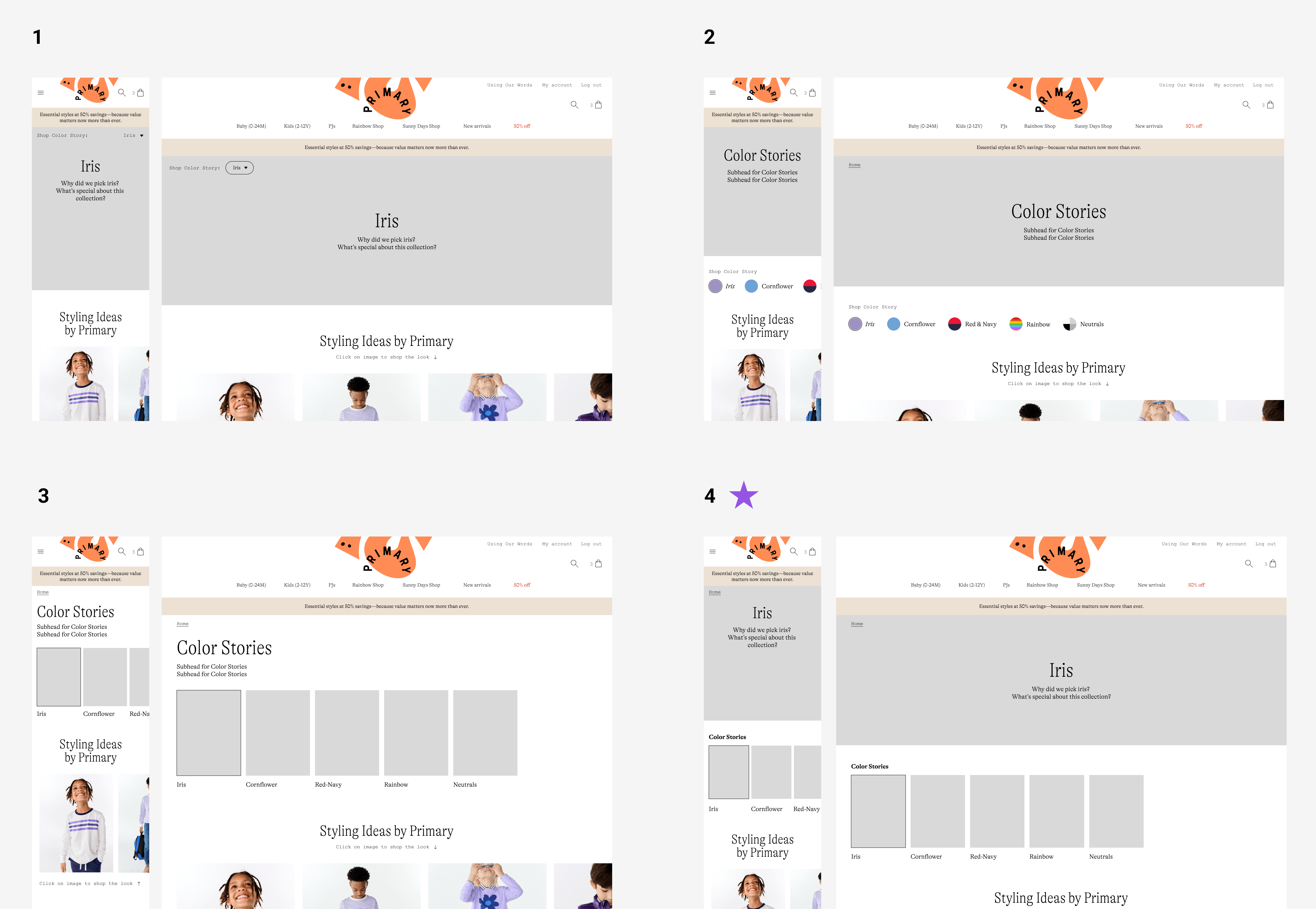
I shared the options with the core group, and internally we felt that option 4 was the strongest. We presented this design in the second Design Review meeting, and it was approved by the co-founders.
Finalizing the content
I passed the approved template to our Photo Art Director and our Senior Content Manager, with whom I collaborated in Figma to finalize the design of the pages. After testing different photo options in the header area, we landed on using pure color for the header background and stacks for the Color Story links.
The final design was handed over to the engineers for development, and I provided visual QA throughout the development process.
Reflections
It was a lightweight but fun project. Here are 3 takeaways I'd like to share:
- Because the idea of Color Story was original, it was difficult to find similar examples in the market and conduct a full-size competitive analysis. Instead, I focused on distilling the strategies from the examples I could find, which worked well.
- Requirements aren’t always fixed. If a requirement doesn’t contribute to the core experience, or if it needs more thought, we should reevaluate it.
- Consider the scalability of new components. We introduced a new component (the links at the top of the template) to the site without considering other possible uses for it. In retrospect, we should have explored other ways/places to utilize this component, and made it more scalable.
Next project: Transactional Email Templates | Primary >>