Admin Panel - Color Management
Redesigned admin tooling to help Merchandising improve work efficiency in managing colors.
8 weeks | 2021
- 1 Product Designer (me)
- Merchandising team
- Engineering Team
- UX/UI Design
- User Interviews
- Figma
- Polaris
Primary is a kids' clothing brand that makes essential, sustainable, and gender-neutral clothes in a rainbow of colors for babies and kids. As of 2021, Primary had more than 350 color swatches on its admin, with more than 60 new colors to be added each year.
In early 2021, Primary finished migrating the customer-facing site to Shopify. However, some admin features not native to Shopify were left on the old admin site which was difficult to navigate and use. So the team decided to build a Shopify app to host the missing admin features and take the chance to redesign a user-friendly admin experience.
The Goals
The main goal for the project was to create an intuitive color management experience that enables the Merchandising team to maximize their efficiency in managing colors. Having learned from the past, we hoped to build the admin panel on top of an information architecture that is clear, well-organized, and scalable.
My Role
The admin panel had multiple parts (e.g., size management, color management, product management, etc.), and I led the redesign of all the color management features.
My contributions include:
- Optimized the information architecture of admin;
- Improved the user flows for the Merchandising team through user interviews and three design iterations;
- Applied Polaris (Shopify’s Design System for building Shopify apps) to the new admin UI;
- Helped scope out MVP and follow-up feature requests so that the Engineering team could focus on building the core experience with limited resources.
Define the Problem
Before this project, I had zero knowledge about how admin functioned and how the data was connected to the customer-facing site. But just because of it, I was able to examine the admin from the perspective of a new user and identify usability issues with fresh eyes.
Analysis of the Existing Experience
After connecting with the Engineering team, I learned that the color management tools had three parts, with each part supporting different user tasks:
- Color filters — add, reorder, remove.
- Color swatches — add, edit, reorder.
- HEX codes — add, edit, remove.
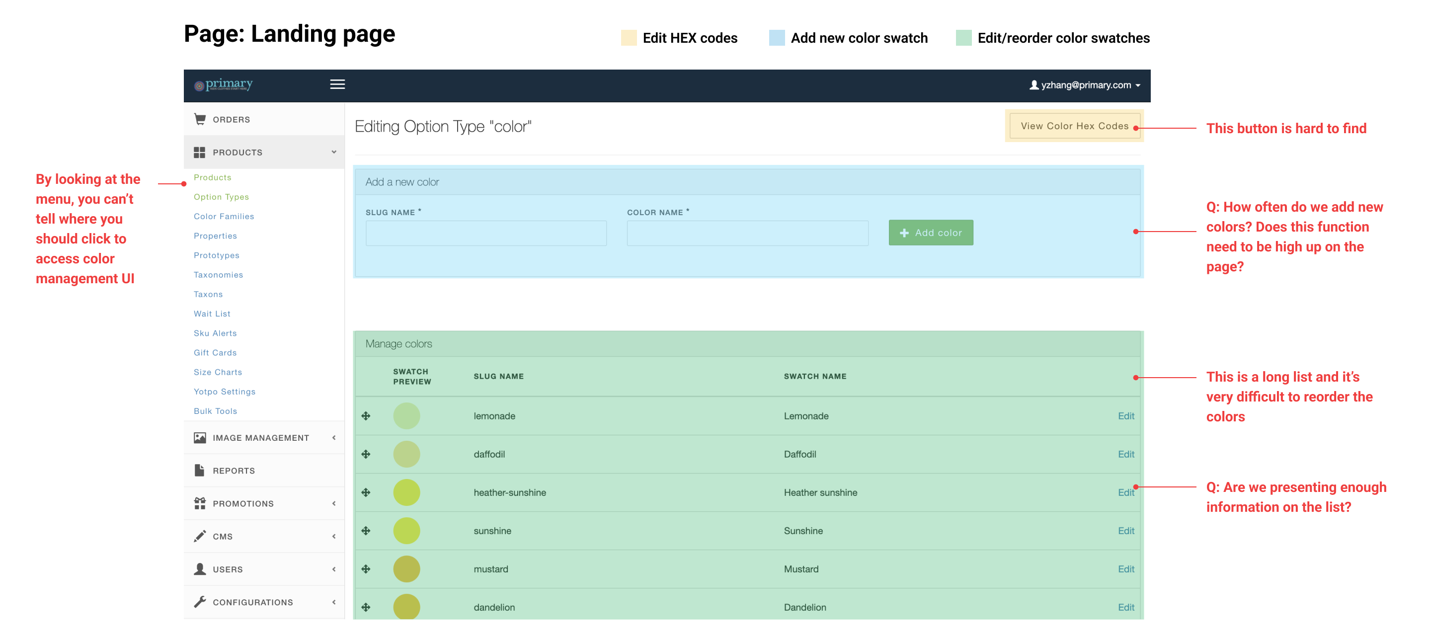
I audited the existing color managing experience by going through each task imagining I were someone managing the site. I took screenshots along the way and noted places that made me confused and areas needing improvement. For example:
I also gathered pain points of the current experience from the Merchandising team:
- Ordering colors was difficult because newly added colors are always at the bottom and the list was very long for drag-and-drop to work.
- The page where users edit color filters were confusing it looked too similar to the page where they edit color swatches.
- Auditing HEX codes was difficult because the list seemed to be ordered randomly.
- Some labels on the inerface were too technical, causing confusions to the Merchandising team.
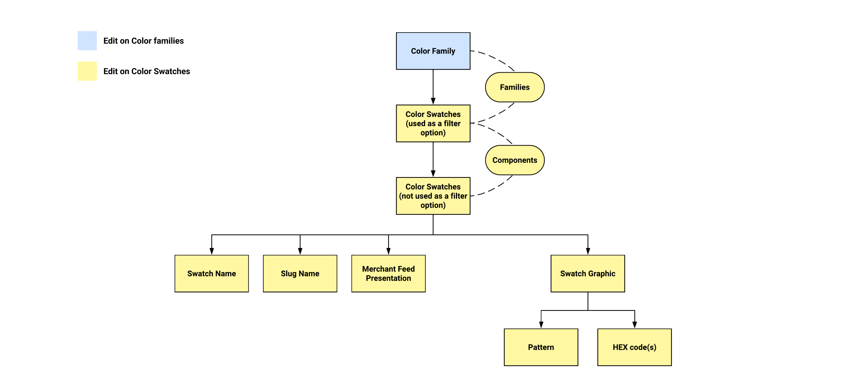
Mapping Out the Information Architecture (IA)
The analysis of the existing admin panel and user pain point #2 indicated that unclear IA was causing users to feel lost when they edit color filters. So I mapped out the existing IA to help me identify places that should be improved:
The Challenges
The usability issues and user pain points all fall under these two challenges:
- How might we improve the information architecture?
- How might we streamline the color managing experience?
The Solution
The new admin panel for color managing was designed to maximize the work efficiency of color managing. A clearer, well-organized information architecture was built, and multiple pages were updated to streamline the experience.
Task-oriented design with Polaris
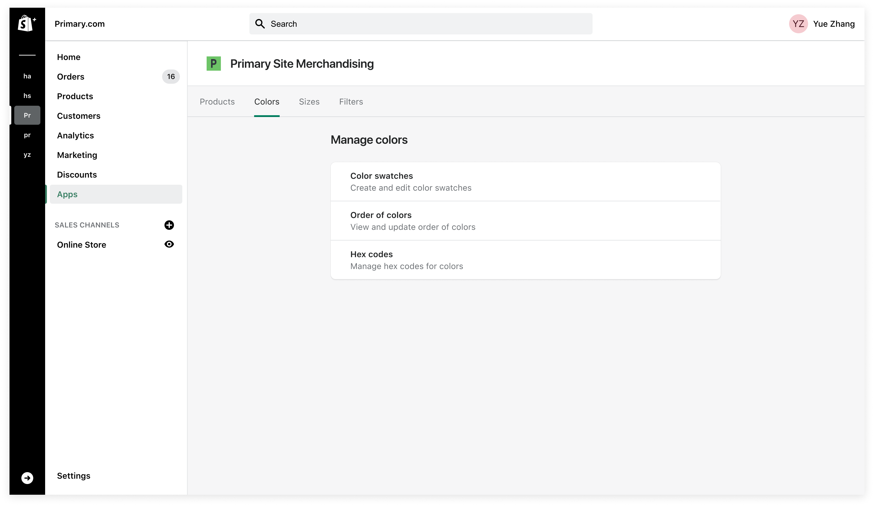
Create landing pages for color swatches and color filters, separating interfaces by task. Only use styles from Polaris for consistency and efficiency.
Use the right layout
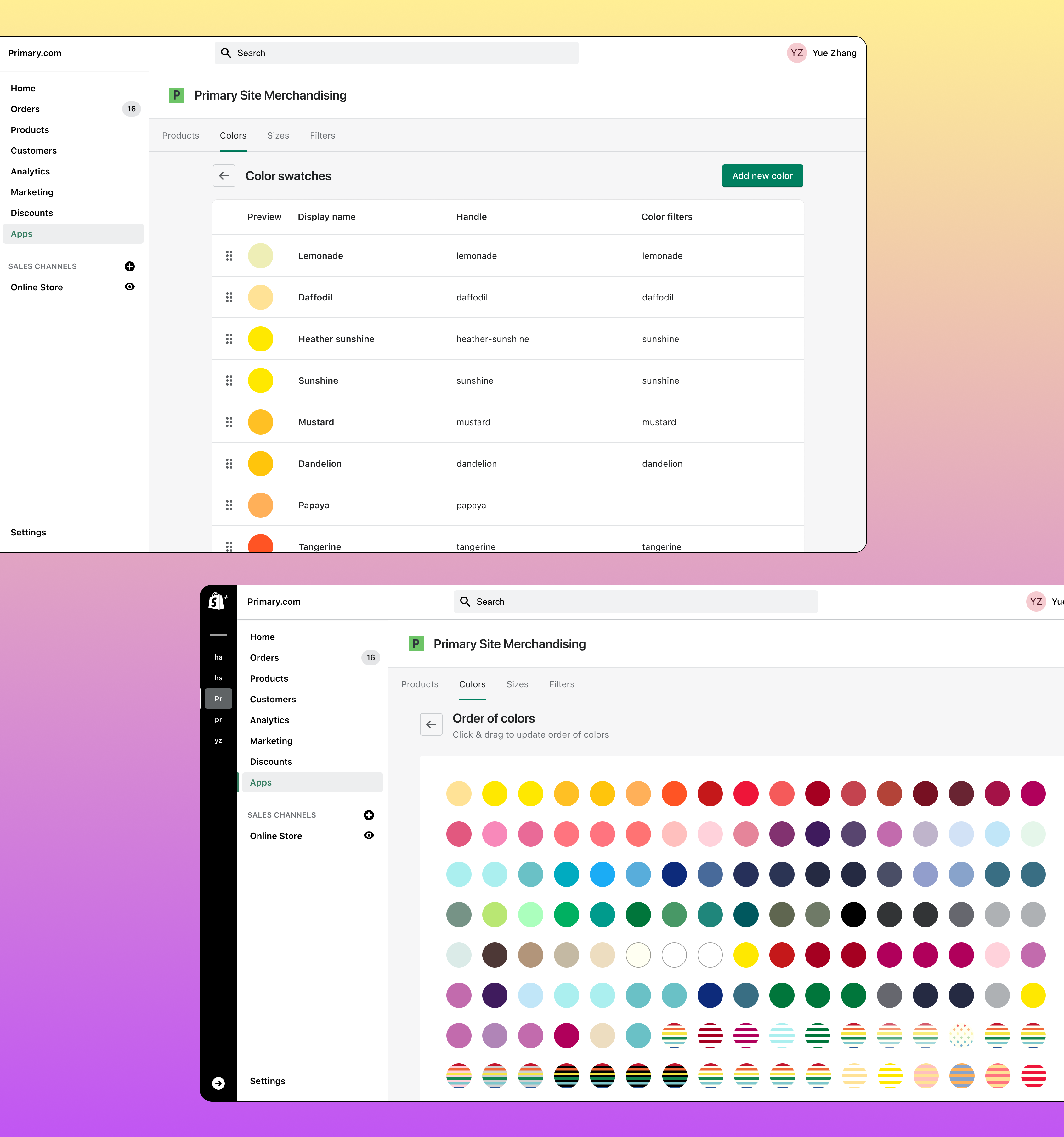
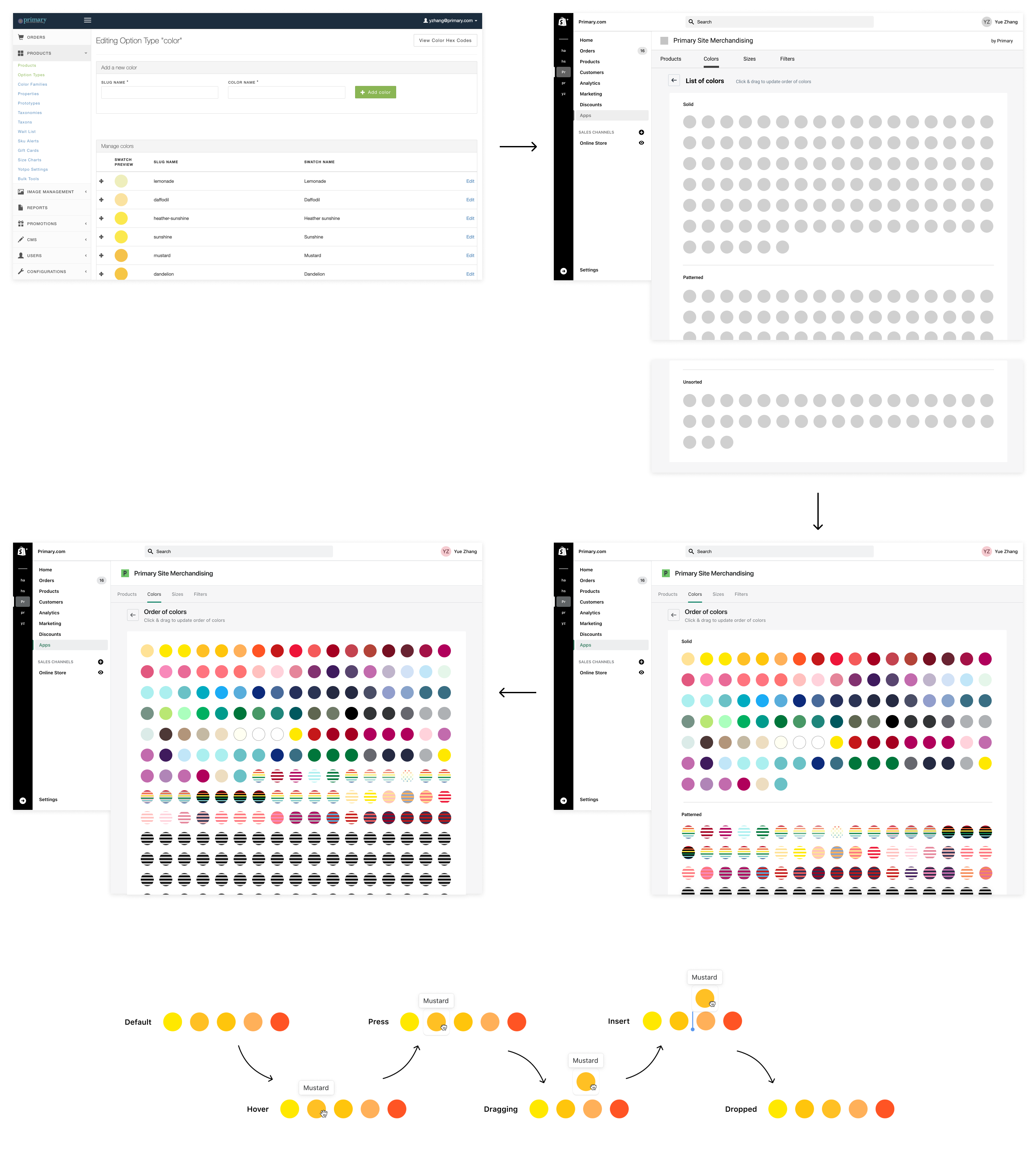
Switch to a grid layout for the Order of colors page, making color ordering much easier.
Optimze lists based on user preferences
Group color filters in the dropdown menu to improve the menu's readability. Order lists alphabetically.
Prevent errors by confirming actions with users
Present users with a confirmation option before they commit to an action that might be a mistake.
Design Iterations
Challenge 1: How might we improve the information architecture?
I proposed a new information architecture to untangle the existing structure:
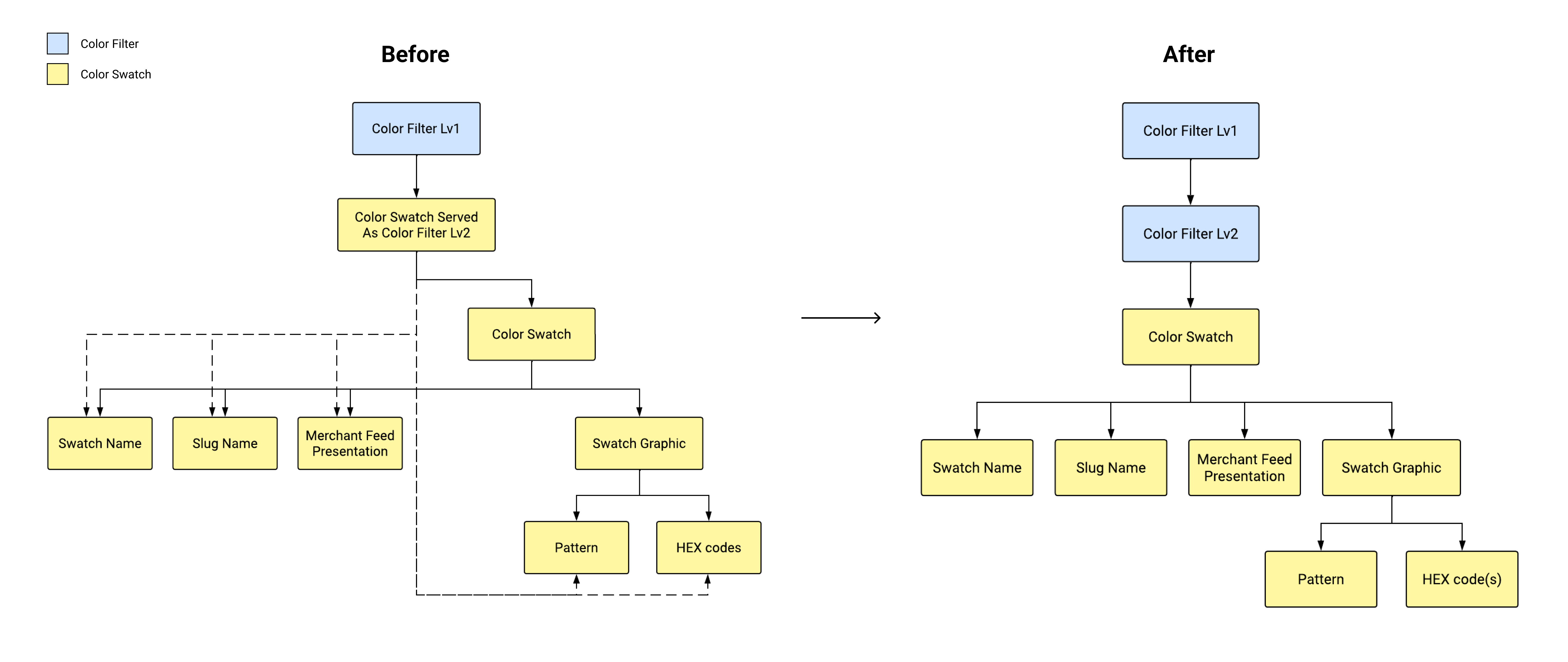
To better communicate my proposal for the new architecture, I created wireframes based on the new IA and shared the user flows with admin users for feedback.
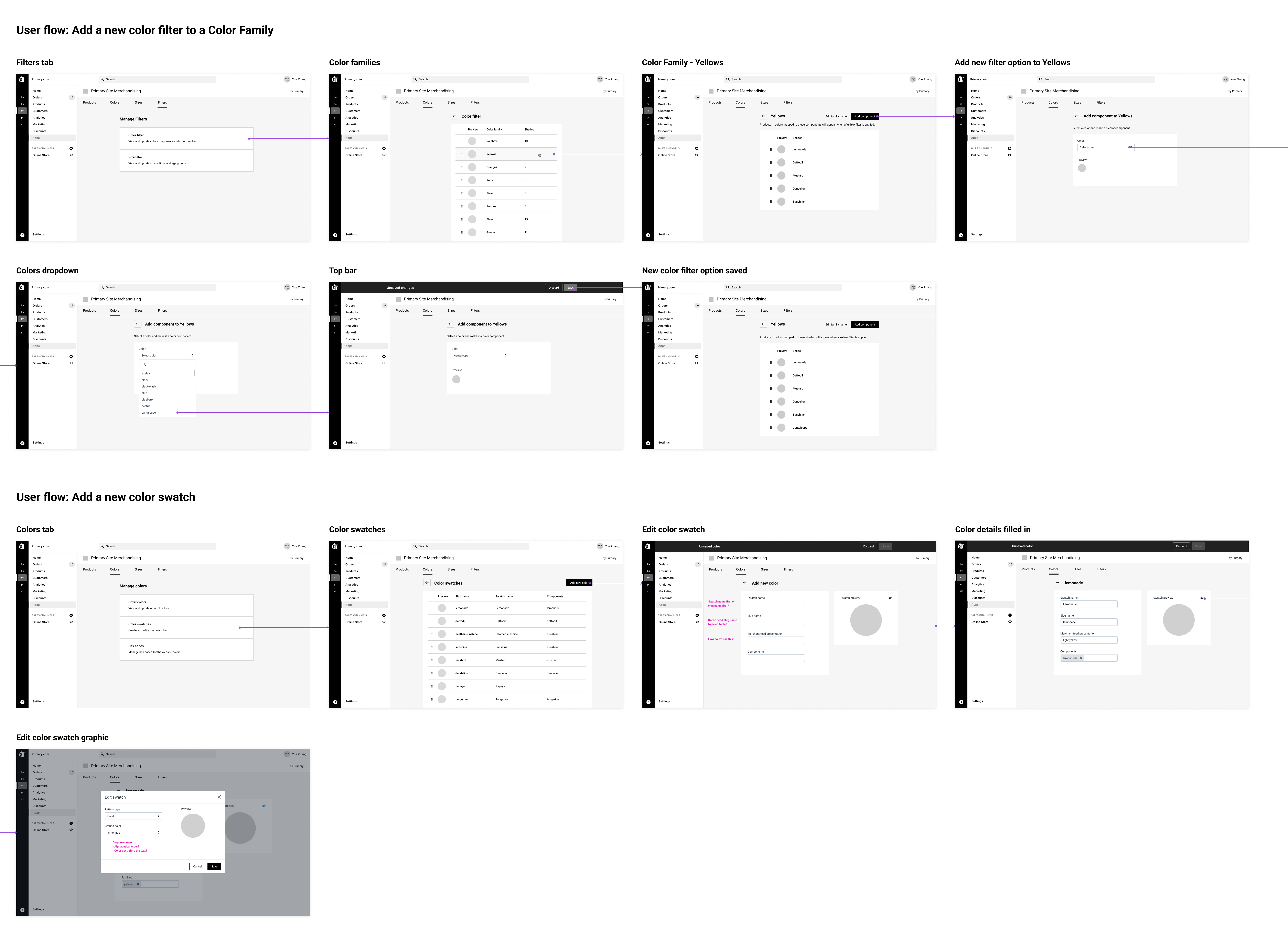
Both users that I interviewed thought the user flows were intuitive. Now that the structure of the house is good to go, I was able to start adding building blocks and focusing on making the house more easy to use.
Challenge 2: How might we streamline the color managing experience?
While conducting an analysis of the existing admin UI, I pinpointed areas for improvement. The issues were addressed by the new design solutions one by one.
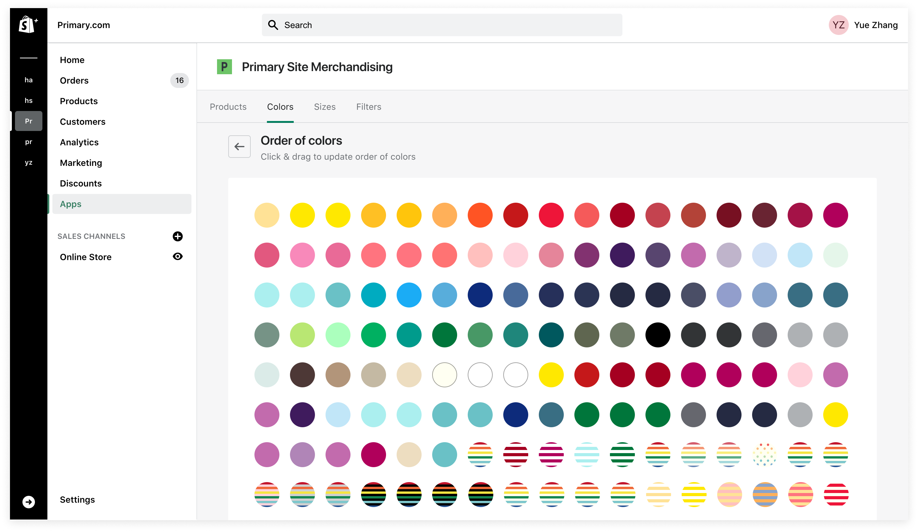
Issue 1: Ordering colors is difficult
Previously, the page where users reorder colors had a list view. When new colors are created, they are added to the bottom of the list which had 300+ colors at the time. It was a tedious and time-consuming job moving the new swatches all the way up to their correct locations.
I proposed using a grid layout in the new design, shortening the page by at least 16 times. The new layout allows users to move color swatches a lot more easily and therefore increases their work efficiency. The main user that orders colors commented: "...ordering colors and setting up new colors are really two separate tasks. In the grid view, being able to see the color dots close together is very helpful."
In the second iteration, I shared the design with the Engineering team and they raised a concern about sorting color swatches into different groups by pattern — it would add a lot more complexity to the project. Since grouping color swatches isn't essential to the new experience, I dropped it in the last iteration.
Issue 2: Lists are difficult to browse
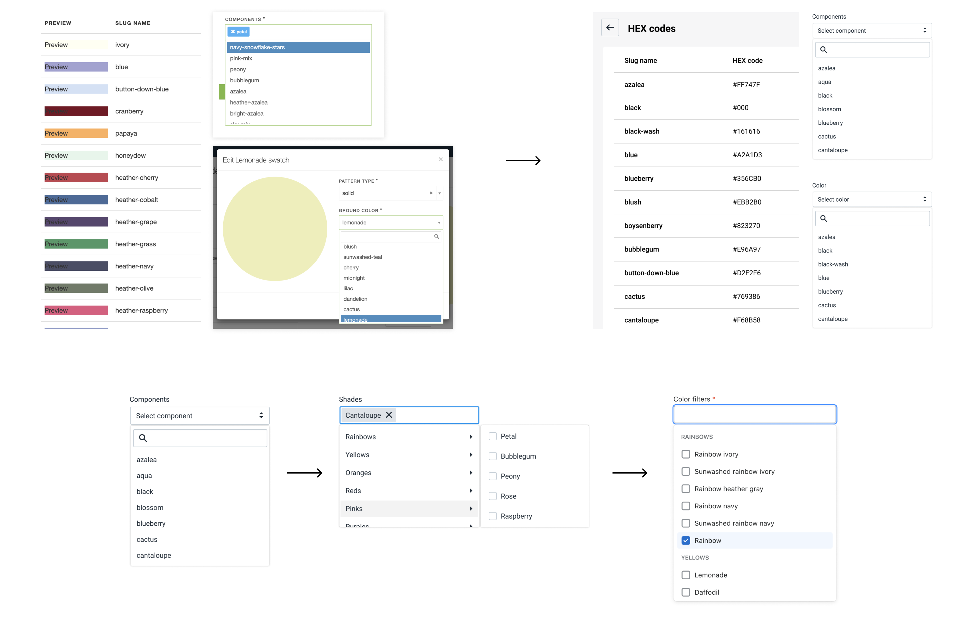
Previously, many lists on the admin panel were not ordered in a user-friendly way, making the lists difficult to browse. Some lists such as the Components list even had many irrelevant list items.
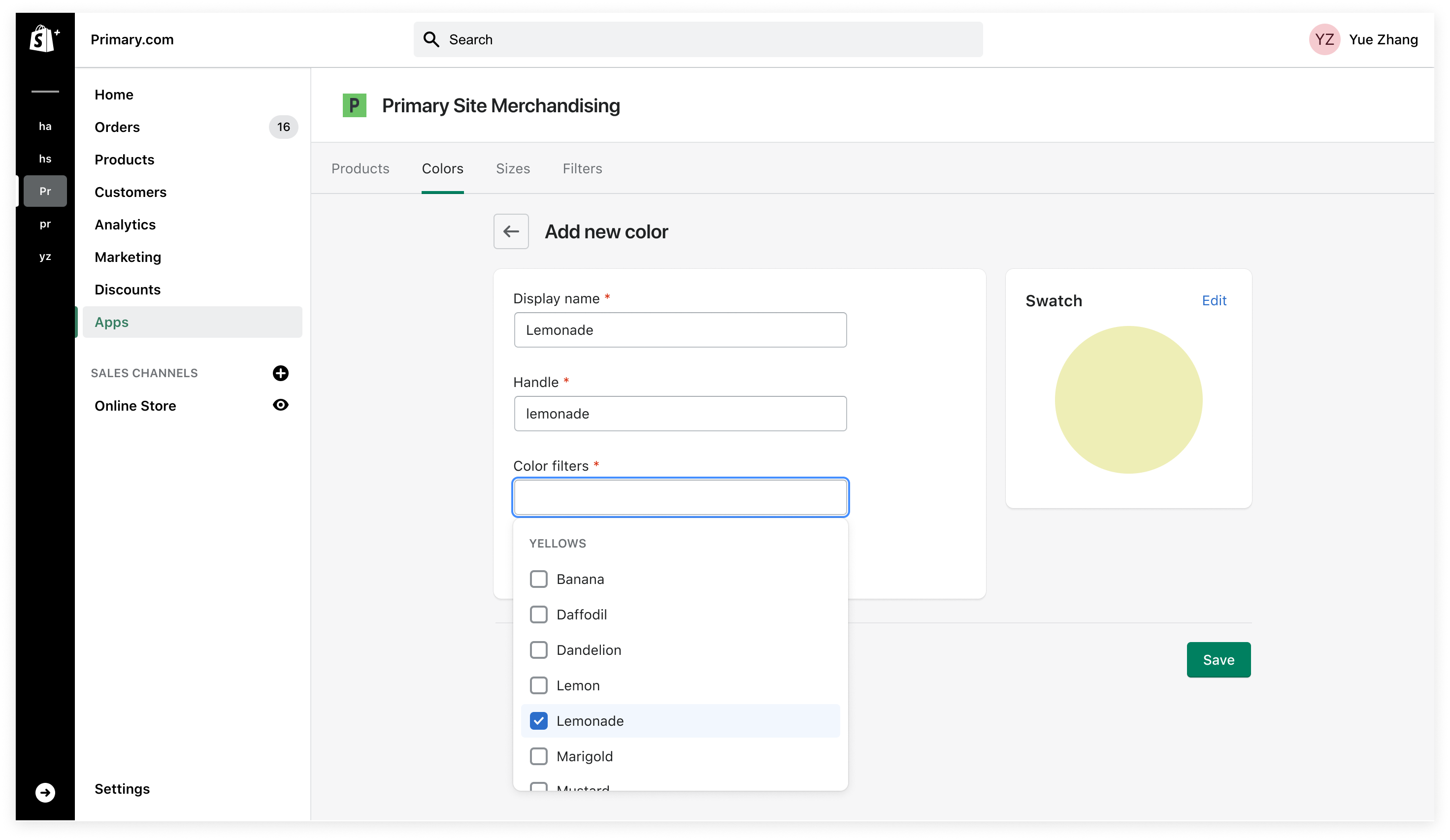
After confirming with the main users, I decided to order the lists alphabetically. I also added a request to the Engineering team to clean up the data so that users don't see random options on the lists.
In iteration 1, the main user from the Merchandising team mentioned that "the Components dropdown menu is really long and difficult to scroll, so some way to group colors would help." So I explored organizing components in a 2-level menu. While the Merchandising team liked this design, the Engineering team thought it would require too much effort to build a 2-level menu. Therefore, in the third iteration, I updated the menu to be a single list but grouped the components by color family, and then added a label at the top of each group. This list style is native to Polaris, so our engineers didn't have to build a new menu style.
Issue 3: System status is not clear
In the previous design, it wasn't clear where the page was in the site map and it was difficult to navigate the site in general. There were also places where there was missing clear feedback after the user took an action.
To address the issues, I made sure there were visual indicators to inform the current location on each page. I used feedback-related patterns from Polaris such as the contextual save bar, banner, and toast to keep consistent with Shopify admin.
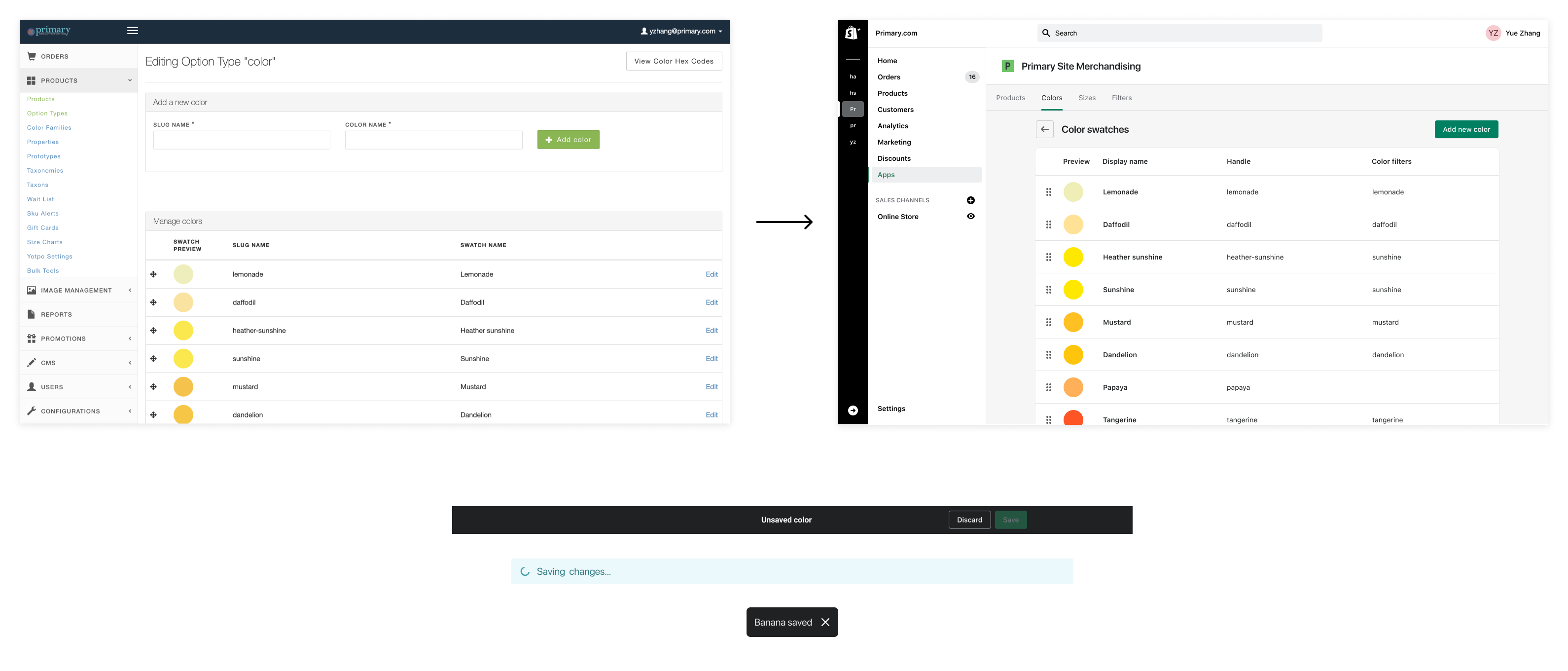
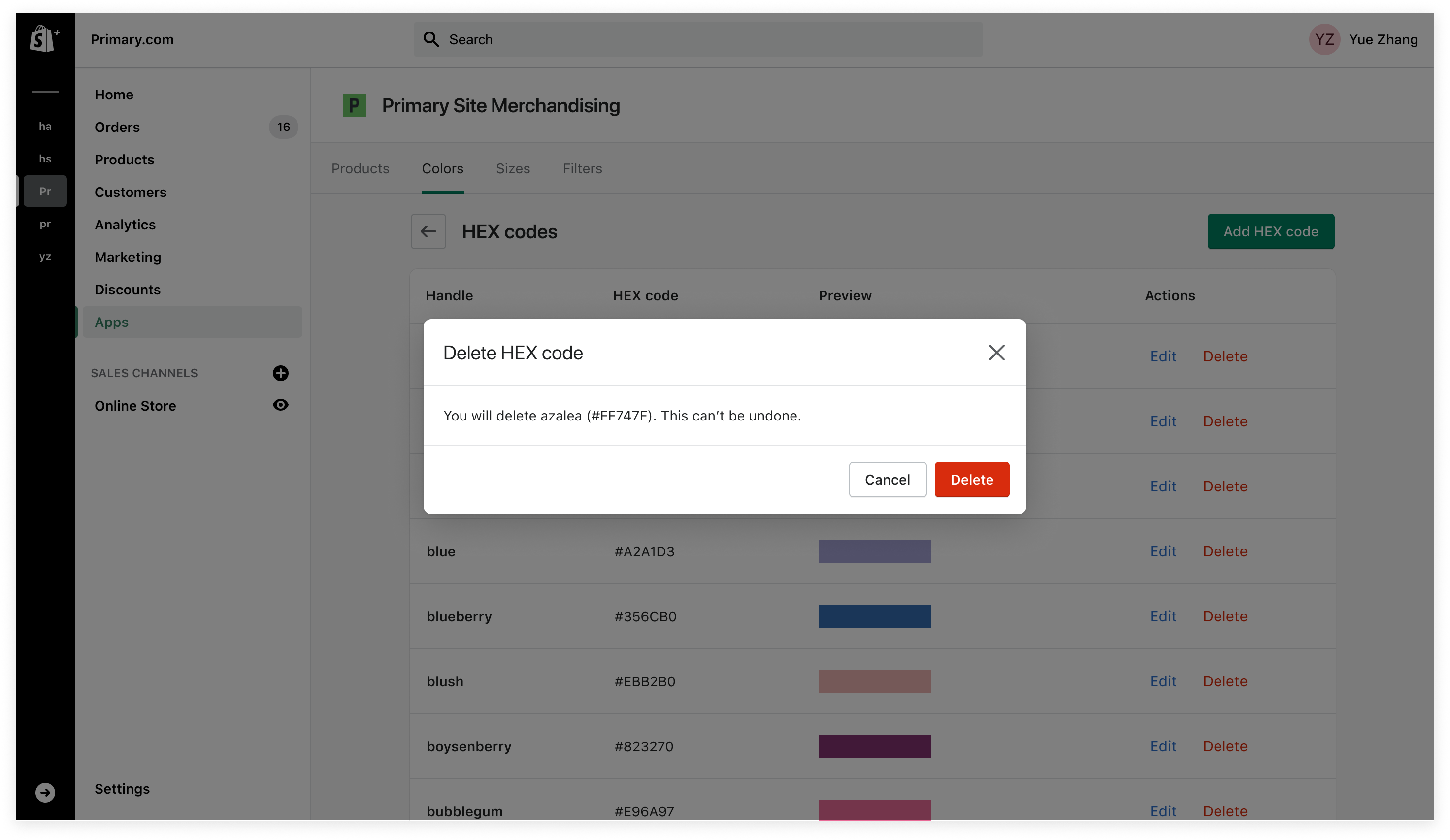
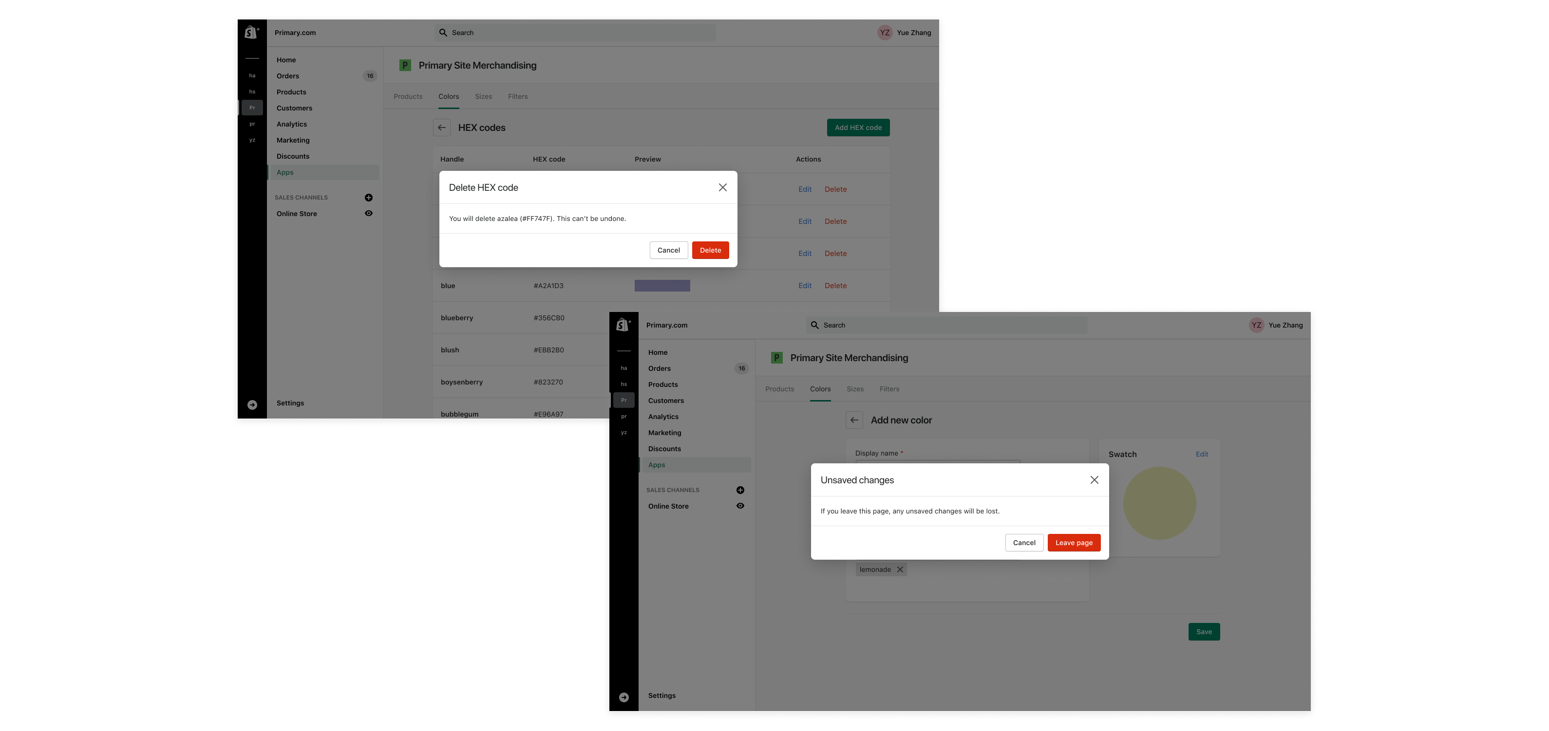
Issue 4: Lack of error prevention
During the initial analysis, I discovered that some actions that could be triggered by slips or mistakes were missing an error prevention mechanism. For example, on the new swatch creation page, if users hit the back button in the browser, they would miss all the previous edits and go back to the colors list. Users also didn't get a warning when they clicked the Remove button on the Hex codes page, which was very dangerous because each Hex code was linked with many color swatches, and each color swatch could be used by multiple products.
Knowing this, I made sure in the new design when users try to perform an action that could be a mistake, a confirmation dialog is in place to help prevent mistakes from happening.
The Outcome
The main user of the color managing UI, our Merchandising team, was very satisfied about the design improvements. According to the feedback collected from the Merchandising team after the design was shipped:
- The new design was "very intuitive and easy to navigate".
- On average, the new UI reduced time spent on ordering colors by 50%.
Reflections
This was the first I worked on an admin-facing tooling and I really enjoyed crafting simple, intuitive experiences with the goal of maximizing users' work efficiency.
I became better at time management in this project. Because our Merchandising team is always very busy, it was difficult to schedule meetings with them. So instead of waiting to collect pain points from the user directly, I spent the time learning about the user tasks, forming opinions about what needed to be changed, and creating wireframes for a more efficient kick-off meeting.
In retrospect, there was one thing I could have done better: try to use existing styles from the component library instead of creating new ones. This would help reduce workload for engineers and simplifies maintenance in the future.
Next project: Transactional Emails | Primary >>