Quick Add in Shopping Bag
Led the design of a new shopping bag feature that recommends complementary items for customers, improving key shopping bag and order metrics.

7 weeks | 2024
1 Product Designer (me)
1 Software Engineer
Data Scientist
Project Manager
E-Commerce Team
Merchandising Team
Market Research
UX/UI Design
Visual QA
Figma
SASS
React
Primary is a NYC-based kids' clothing brand that makes essential, sustainable, and gender-neutral clothes in a rainbow of colors for babies and kids. As the sole Product Designer on this project, I collaborated closely with 3 teams on designing and shipping a new shopping bag feature that is now live on Primary.com.
Define the Problem
Business Goal
In 2023, as Primary continued to grow, the company sought ways to improve key order metrics such as UPT (Unit Per Transaction) and AOV (Average Order Value). To support this goal, the Merchandising and E-commerce teams identified an opportunity: increase the visibility and sales of less popular products like hats, mittens, and socks.
Since these accessories are low-cost and ideal add-ons, the strategy focused on featuring them on the Shopping Bag page, where customers review and make final changes to their orders.

Customer Problem
When a customer reaches the Shopping Bag and realizes their subtotal doesn’t reach the free shipping threshold, they would need to spend extra time searching for low-cost items to qualify for free shipping, or choose to abandon the order.
In a previous survey study, we learned that 42% of our customers abandon their shopping bags because "Extra costs are too high (shipping and tax)". While we can't eliminate these costs, we can reduce friction by making low-cost, add-on products easier to find.
So, how might we improve the visibility of low-traffic products on Shopping Bag and help customers pass free shipping threshold with little effort?
Final Design
Add accessories to bag with just a few clicks.

A shorter Shopping Bag that's easier to scan.

Designed for mobile (first!) and desktop, ensuring an optimal experience across devices.

Unpack the requirements
To understand project requirement details, I connected with the SVP of eCommerce and the project manager, using the 5Ws + 1H framework to guide my inquiries.

Research
Learn from the market
With the project goals and requirements in mind, I reviewed over 80 e-commerce sites and identified 10 with shopping bag features similar to what we envisioned. I summarized key findings and compiled screenshots of each example in a Google Slides deck, which was shared with key stakeholders over Slack and in project meetings.

Inspect the existing Shopping Bag performance
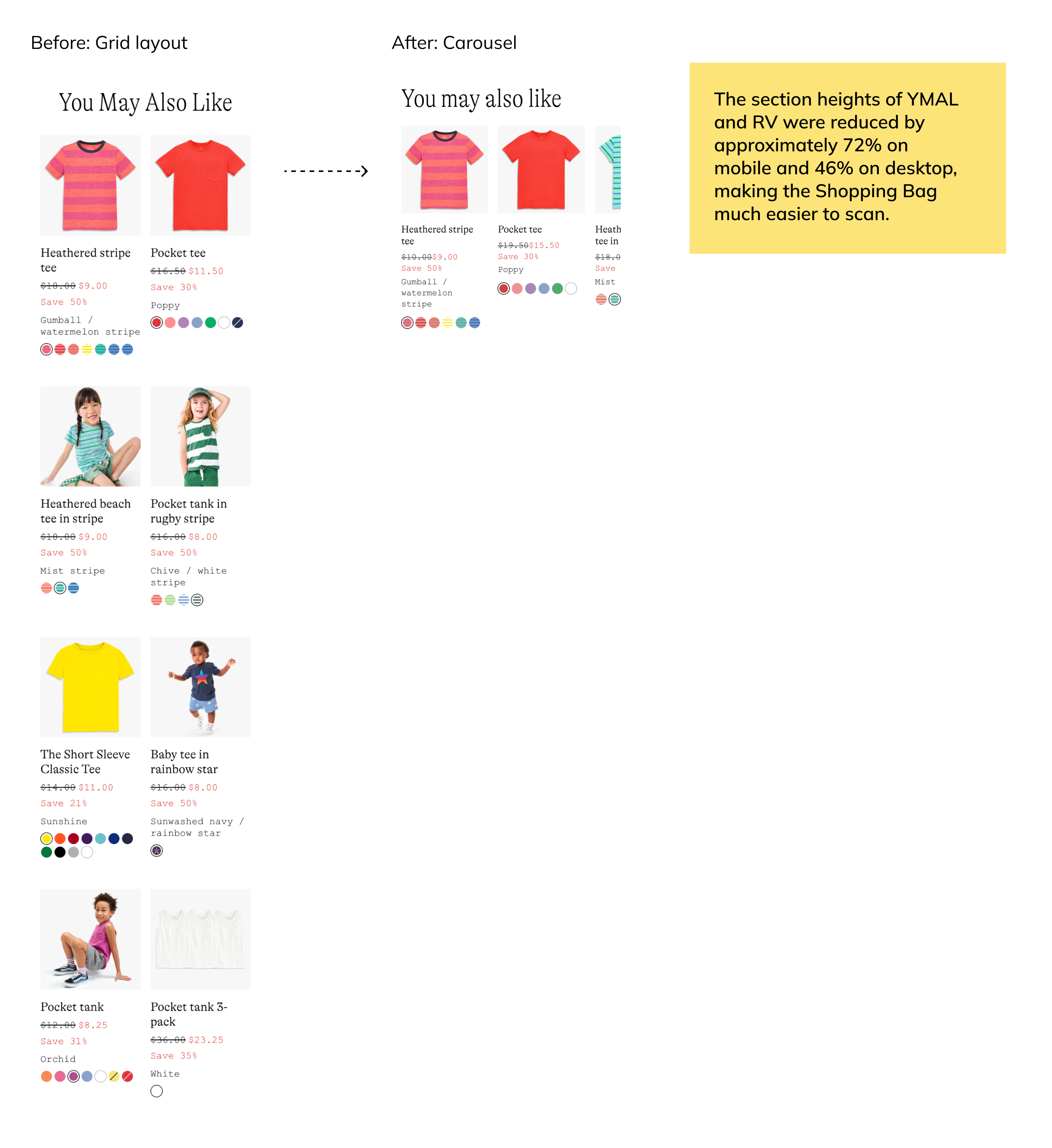
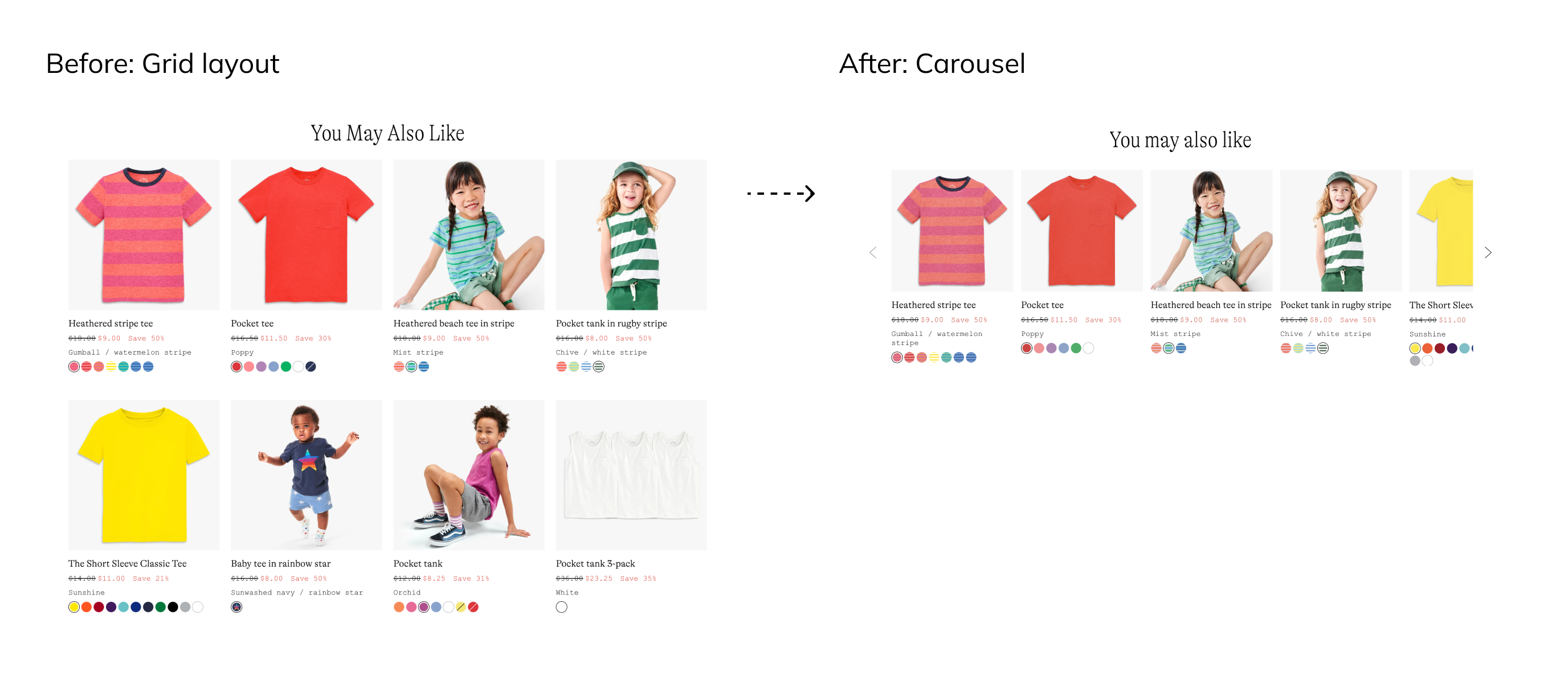
Since the Shopping Bag already had two product recommendation sections—You May Also Like (YMAL) and Recently Viewed (RV), adding Quick Add risked making the page too long, especially on mobile. The market research also indicated that most sites keep their shopping bags simple by limiting recommendation sections to two. To determine whether both YMAL and RV should be kept, I collaborated with our Data Scientist to analyze their performance.

We learned that both YMAL and RV contributed meaningful revenue each year. Rather than removing one or both of them, I suggested using carousels to improve the scannability of Shopping Bag. The E-commerce team took my suggestion and later we tested this idea through an A/B test. The result suggested there’s no significant difference between control and test groups in key order metrics. So we pushed this change to all users before the release of Quick Add.
Design Process
Iteration 1-2
In the first 2 iterations, I explored different location options with various UI treatments based on project requirements and learnings from the market.

Feedback from Product, Engineering, and E-commerce helped answer two key questions:
Q1: Where is the best place to recommend Quick Add products?

Q2: What information is essential for customers to make a decision?

I presented the most promising options from iteration 2 to the co-founders for feedback, which helped shaping the feature:
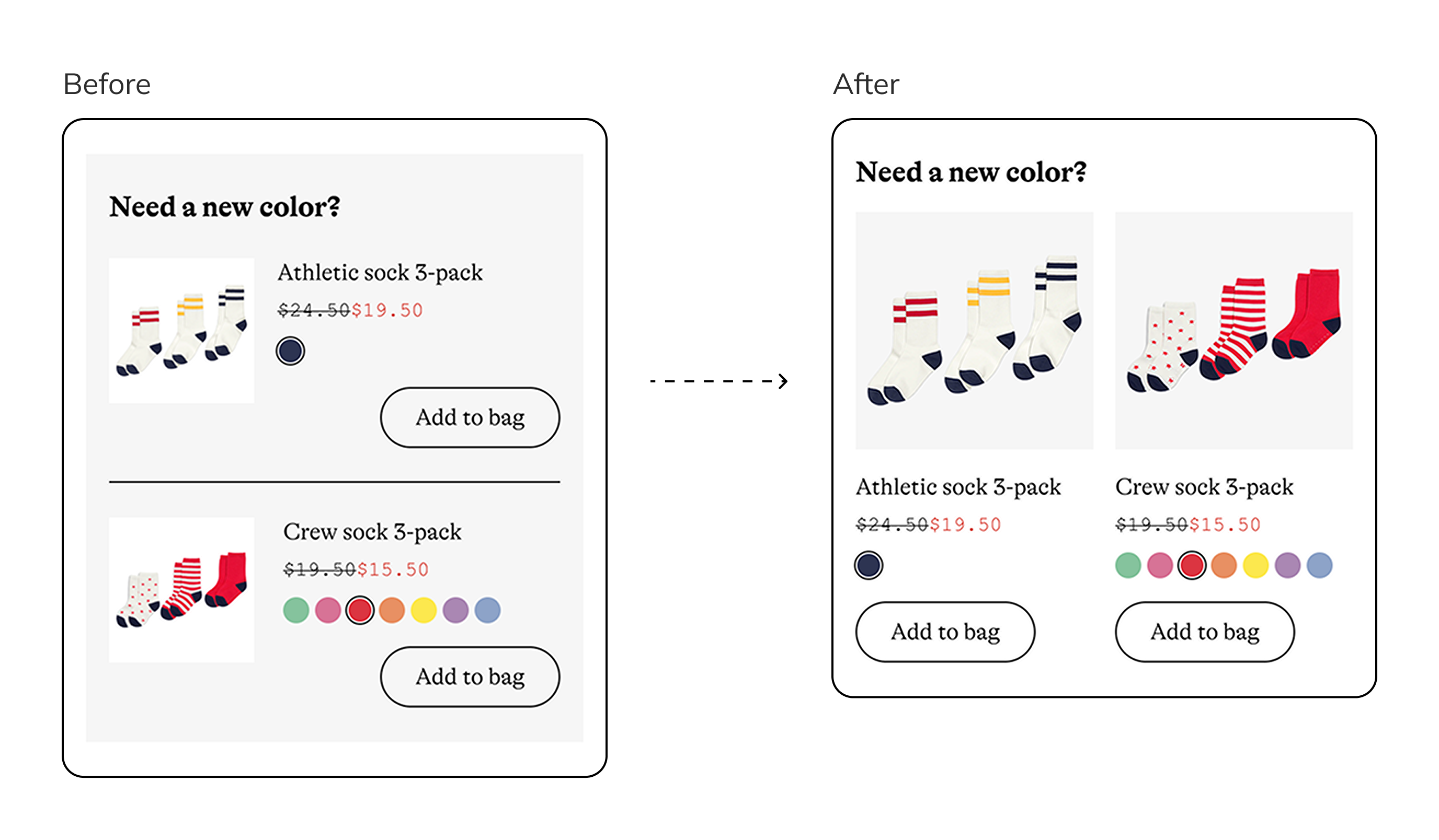
- Limit the number of products in Quick Add to 2 to simplify customers' decision process.
- Make sure customers don't miss Quick Add so that we can collect A/B testing data in a shorter period of time.
Iteration 3-4
Based on leadership feedback, I continued refining the designs to simplify and prioritize Quick Add.
To create a more cohesive look, I explored using a light gray background from Primary’s style library for the Quick Add section in some design options. Since all product images already had a gray background, I adjusted their background color to white to ensure clear differentiation within the section. The feasibility of implementing this background adjustment was confirmed by Engineering and the Digital Asset Manager.

One more (unexpected) iteration
During the implementation phase, the lead engineer identified a significant challenge with adjusting product images: storing and fetching a separate set of images for Quick Add products would introduce substantial technical complexity and potentially delay the launch.
To address this, we evaluated our options and decided to modify the UI to avoid the need for new product images. I iterated on the design, maintaining the original image backgrounds, and presented the updated options for approval.
Design Handoff
I speak CSS for a more efficient communication with engineers.

The Outcome
The Quick Add feature was successfully launched as an A/B test in June 2024, demonstrating a positive impact on user behavior. Key results include:
- Sessions that engaged with the feature had a 10% ↓ in cart abandonment rate.
- Sessions with engagement had a 17% ↑ in UPT.
- 17% of sessions passed the free-shipping threshold after adding products from Quick Add to bag.
Reflections
In this project, I became more skilled at navigating unexpected constraints and pivot quickly. I learned to maintain focus on delivering effective solutions instead of the stress itself.
Due to time constraints, we couldn't validate our assumptions before launch. I would like to gather insights from users and understand how this feature have been perceived and used. I have suggested to the team to conduct a post-launch usability testing when bandwidth allows.
The key to successful product recommendations is making the suggestions relevant to the customer. If we could leverage the customer's order history or browsing behavior, we can personalize Quick Add suggestions and make the feature more impactful.
Next project: Admin Panel | Primary >>